I haven’t tested on Android, but on iPhone, as soon as my finger leaves the screen, the app stops scrolling.
Is there an option (or an easy javascript/css snippet) to change this behavior and give the scrolling action “momentum” (a quick google search didn’t give me the technical name for this)?
I had the same issue, and after a lot of Googling, I came up with a partial solution (meaning it solves the problem if the screen width is narrow enough to trigger responsive CSS but it doesn’t allow the header to remain fixed).
I added this:
  /* added to allow inertia scrolling on iOS Safari. */
  .content {
    position: absolute;
  }
to this responsive block:
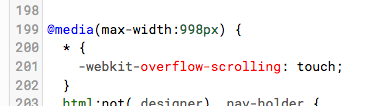
@media(max-width:998px) { ... }
With this change, the header bar is no longer fixed when the responsive block is active, and it allows me to scroll with normal inertia as long as the max-width is <= 998px. So it usually works on iPhone, but on iPad it only works in portrait mode.
I’m absolutely awful at CSS so I was wary of continued tweaking to try to fix it completely. Please report back if you’re able to build on this to solve the issue more completely. Most of my users access the app via iOS so it’s a pretty high priority issue for me.
Interesting! This does seem to fix the scrolling issue… But, it also totally jacks up the rest of my layout, haha. Specifically, my material design cards are way to big and don’t resize to fit in the screen.
I’m going to keep looking, and will definitely report back if I find anything.
I proudly showed my first app to my teenage daughter, who was totally scathing about this issue :-(. HaHa. She pointed out that normal browser scrolling on mobile did operate as expected. I wonder if @meredydd or @shaun have a simple css recipe to solve it.
The iPhone browsers (both safari and chrome) do not appear to use accelerated scrolling. So as soon as you lift your finger from the screen the scolling stops.
Interestingly, the touch pad and screen of the Asus Chromebook, does not have this problem and scrolling works as expected.
Other websites on the iphone also work as expected when it comes to scrolling.
Not having a good resolution for this really distracts from the usability of anvil apps in the mobile setting.
The hamburger menu is there for me in your app on iOS Chrome and Safari. It wasn’t there in my example app because I hadn’t added any links to the sidebar (which I have now done, and it is now present).
Oh yes, it seems that the -webkit-overflow-scrolling property is not playing nicely with the sidebar.
That makes our solution a bit more complicated: the element that needs the property applied to it is .nav-holder, which contains both the main content div and the sidebar div. We need the property not to apply when the sidebar is open.
Fortunately, we have JavaScript functions that run when the sidebar is open - hideSidebar and showSidebar. We can create a class that applies smooth scrolling, and modify the JS functions to add/remove that class:
  function showSidebar() {
    $('.nav-holder').removeClass("smooth-scroll");
    // ...
and
  function hideSidebar() {
    $('.nav-holder').addClass("smooth-scroll");
    // ...
Give the .nav-holder div the smooth-scroll class from the start:
<div class="nav-holder smooth-scroll">
and change the CSS rule to apply only to elements with .smooth-scroll:
For future me and others: @shaun’s changes are in standard-page.html and theme.css. diffchecker.com helped me figure out where exactly they should go in my own app.