What I’m trying to do:
I’m trying to make floating menu which is resized automatically.
I have done below,
-
copy standard html to floating-menu.html
-
edit and add some html, and css code based on tutorial Integrate Mapbox into your Web App using only Python
-
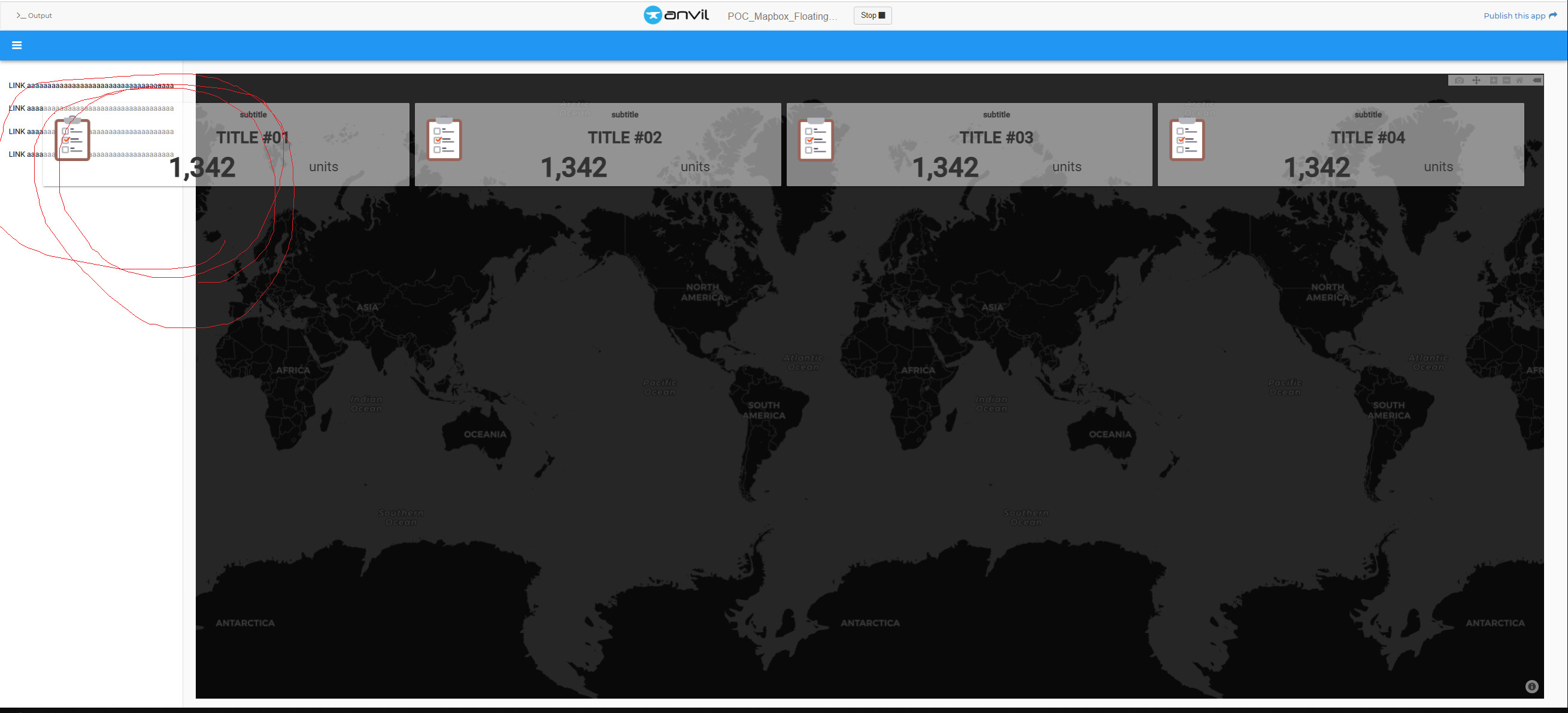
I hope to make floating menu placing in content area and resized automatically.
Code Sample:
css setting
.flex-container{
  display:flex;
  flex-direction: row;
  flex-wrap: nowrap;
  justify-content: space-evenly;
}

.flex-item {
  flex-basis: 100%;
  margin: 5px;
}

.floating-menu {
  position: absolute;
  z-index: 100;
  overflow-x: hidden;
  width: calc(100% - 140px);
  min-height: 140px;
  min-width: 140px;
  margin: 20px;
  padding: 5px;

  top: 100px;
  left:50px;
  right:50px;

  background-color: rgba(229, 213, 194, 0);
}
custom html code,
 <div class="nav-holder">
    <div class="left-nav anvil-measure-this" anvil-slot-repeat="left-nav" anvil-drop-container=">.anvil-container">
    </div>
    <div class="left-nav-placeholder anvil-designer-only" anvil-if-slot-empty="left-nav" anvil-drop-slot="left-nav">
      <div class="prompt">To add a sidebar, drop a ColumnPanel here.</div>
    </div>

    <div class="floating-menu flex-container">
        <div class="flex-item" anvil-drop-here anvil-slot=".kpi1"></div>
        <div class="flex-item" anvil-drop-here anvil-slot=".kpi2"></div>
        <div class="flex-item" anvil-drop-here anvil-slot=".kpi3"></div>
        <div class="flex-item" anvil-drop-here anvil-slot=".kpi4"></div>
      </div>
    <div class="content">

      <div anvil-slot-repeat="default" class="anvil-measure-this"></div>
      <div class="placeholder drop-here" anvil-if-slot-empty="default" anvil-drop-slot="default">Drop a ColumnPanel here.</div>
    </div>
  </div>
python codes, anvil.js.window gave me lots of possibilities.
  def form_show(self, **event_args):

    window.onresize = self.resize

    self.plot_1.layout = go.Layout(
      margin=dict(l=0, t=0, b=0, r=0),
      mapbox=dict(style='carto-darkmatter')
    )
    self.plot_1.data = go.Scattermapbox()

    self.resize(None)

  def resize(self, test):

    dom_map = anvil.js.get_dom_node(self.content_panel)

    self.plot_1.height = window.innerHeight - 105
    self.plot_1.redraw()
Clone link:
https://anvil.works/build#clone:BQ5GZOOBHHGHK23A=6AHDIZZF2JMFXMKY3HYQP7D3