This is in every set of visual components I’ve ever used: a scroll panel. Everything placed inside the panel can grow and scroll to its heart’s content. It can be surrounded by panels that are pinned to the edges of the window, so that their contents do NOT scroll.
Non-scrolling areas are essential for the end-user. Navigation controls and status displays (e.g., “where am I”), belong in those areas, so that they are always visible, the end-user does not get lost, and can always see a way out from their current location.
So far, I have not found a way to do this in Anvil. If there is a way, even a roundabout way, I’d love to hear it!
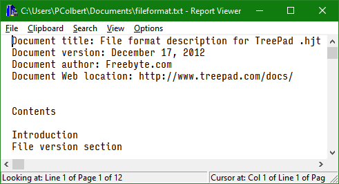
Here’s an example from a desktop app:
Note the vertical and horizontal extent of the scroll bars. No matter what you do with them, the title bar and the top menu remain visible, and so does the status bar at the bottom.
Given today’s extra-wide screens, with plenty of horizontal space (and vertical space at a relative premium), it may make more sense to put the menu in its own panel at the left, and the status/navigation in its own panel at the right. But they should each scroll independently.
Sounds like you’re talking about building a custom visual component for Anvil. I don’t have the background for that, yet, but I’ll keep that option open.
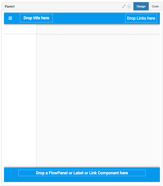
It adds a footer element to the material design standard-html
Not very well tested so I’m sure i’ve missed some css… (i’ve put the extra css as the bottom of the theme.css)
This is Cool!!
I dropped a few components and it seems to function as expected.
Having a component with a “pinnable” property, like a card, using this technique would be great.
I might try use your code and see if what I come up with over the weekend.
Thanks very much