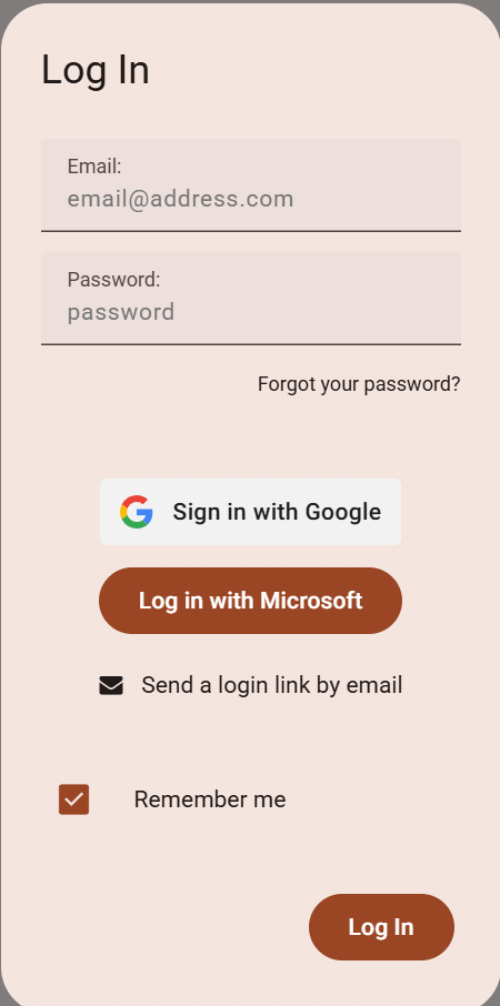
So we have Login with Microsoft enabled for users, however it looks like the M3 Beta design overrides the expected look with logo.
Login with Google looks right.
So we have Login with Microsoft enabled for users, however it looks like the M3 Beta design overrides the expected look with logo.
Login with Google looks right.
Sorry didn’t mean to post this under feature request, maybe the category of Q&A
Hi, @masikh,
Thanks for reporting this! You’re right that the button should have Microsoft’s branding. I’ve now added it to our list so that we get it fixed.
Hi,
Looks like someone tried to fix this. It looks much better but the white/corners/background is inconsistent and impacting my OCD… It also gives the impression there’s a preference towards Microsoft.
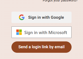
We’ll have a look at this. The button is based on the official Microsoft branding
Fair enough. Looks better than before anyway
we’ve added an escape hatch for css overrides
you can do something like this
microsoft-signin-button::part(button) {
    border-radius: 8px;
    box-shadow: 0 2px 8px rgba(0, 0, 0, 0.2);
}
(adjust as you need)
Legend @stucork - for those in the future, nearest I got is this
  microsoft-signin-button::part(button) {
      border-radius: 4px;
      border: none;
      background-color: #f1f1f1;
      color: rgb(28, 27, 31);
      box-shadow: none;
      font-family: roboto;
      font-size: 14px;
      font-weight: 500;
  }

  microsoft-signin-button::part(button):hover {
      background-color: #e8e8e8;
  }