Introducing Four Improvements To Custom Components
Anvil’s Custom Components allow you to build reusable UI components and use them throughout your app and others. We’ve recently made them easier to use and more flexible.
1. Live Updates in the Editor
Now, as you make changes to your custom component, you’ll instantly see those changes reflected in the designer.
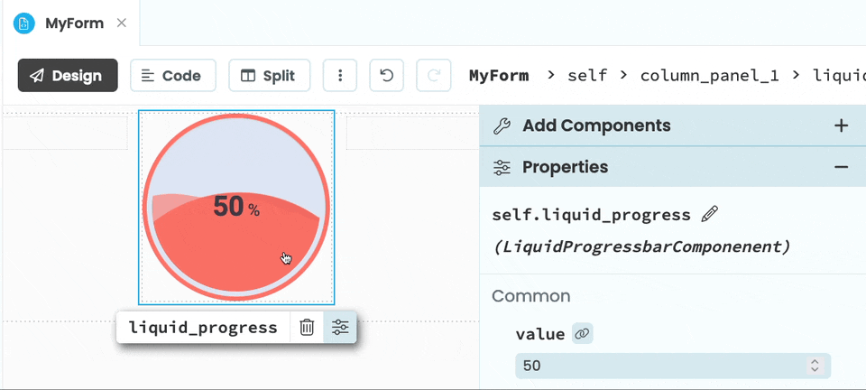
Demonstrating live updates using @tobias.carlbom’s progress bar.
2. Categorize and Add Toolbox Icons
To help you keep things organized, you can now categorize custom components and change their icons.
3. Categorize Custom Component Properties
You can also categorize your custom component’s properties.
4. Create Your Own Custom Containers
For the first time ever, it’s possible for you to build your own custom containers!
