I’m teaching a machine learning course this semester, and I found that there wasn’t a platform to set up machine learning competitions for purposes like this. So I decided to make it myself!
Here is the basic functionality:
- Single sign on with our G Suite accounts (limited to registered users of the course)
- Nice presentation and UI with multiple tabs for each problem set (I thought this would be hard but it was easy!)
- Be able to download training data, see problem description, and see other necessary info (basically just text)
- Be able to submit their predictions!
- A dynamic leaderboard that will update the standings once scores are calculated.
Getting the basic functionality working took about 10 hours of solid work. I made it in a modular way that took a bit more time but I think it will be helpful in future semesters when I want to use it again.
Updating with new problem sets takes about 15 minutes once I have the data and details ready. Mostly I just have to check that the scoring code is working correctly.
Screenshots:
Login screen. I’m never good at making these. I think I could benefit a lot from a design course.
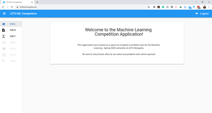
Home page. I set up the navigation to be the primary form with the content panels clearing and filling in based on the selection. Got the idea from the Anvil docs (thanks!).
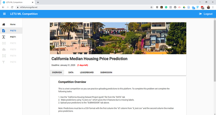
Problem set page. There are 6 major assignments throughout the semester and students interact with them all here. Actual notebooks are submitted and graded via our LMS.
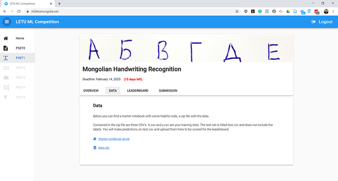
Problem set data page. They are basically direct links to files hosted on Google Drive as the datasets are often pretty big.
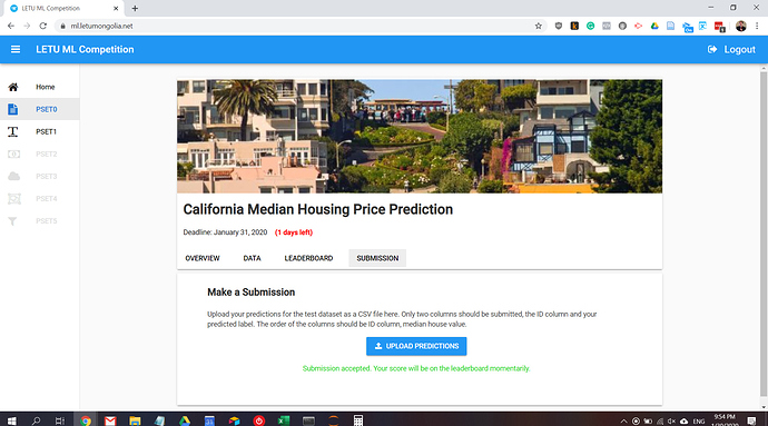
Submission page. Students submit their CSV files with predictions here. A background task is launched to do the actual scoring (as for some problem sets this takes several seconds). There are several validations (due date, max daily submissions, and a generic validation that catches other errors).
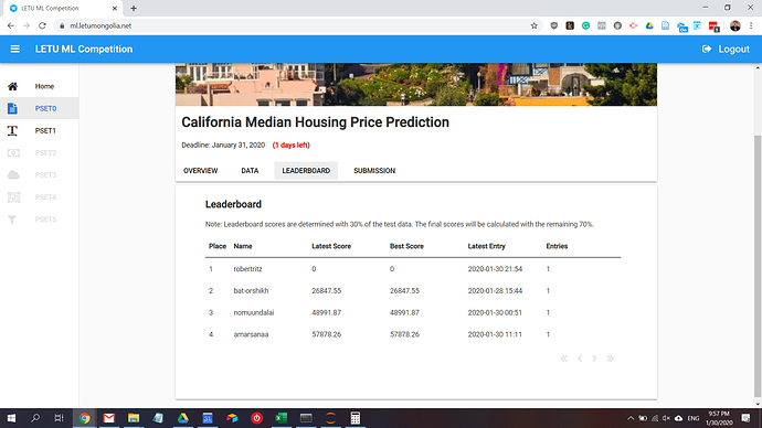
Leaderboard. Calculated on the fly from a Data Table of all problem set submissions. This was chosen over having a separate leaderboard for each problem set to reduce code.
A few notes on the project:
Getting the “tabs” to work was really just using buttons with a tweaked style. These buttons then hide or show cards that are selected. I chose not to do any CSS editing or even role editing because one I start I will probably never stop. This turned out to be easier than I thought! I originally thought a custom component or Javascript would be needed.
Getting CSV importing to work took longer than I expected. I needed to get the CSV loaded into a Pandas DataFrame (or at least numpy array) so it can be scored with scikit learn. I ended up doing the following process:
- Pass the file as an object (appropriately titled file) to a server function
- Use
file.get_bytes()to convert the object to bytes and save asfiledata - Use the BytesIO method from io to pass the data to Pandas (I found StringIO as a suggestion from a few places but it seems the get_bytes method does’t output a true string)
Final code for importing CSV into pandas is like this:
from io import BytesIO
filedata = file.get_bytes()
df = pd.read_csv(BytesIO(filedata), index_col=0)
One thing I would very much like to do is generate a trend graph that I can embed in a cell on the leaderboard similar to sparklines. Too much work for now but always room for improvement.
Also, this is the first project I tried using Uplink on. I found that it is an excellent tool to prototype code quickly in Jupyter Lab. I can play with the data that is passing in and out of Anvil and this speeds up my coding when using dataframes, dictionaries, and other data at least 10x. A tip though is to kill the kernel in Jupyter Lab when you want to test your code so you don’t have stray objects floating around!
Another excellent development experience!

