I have an app I have been building for some time. Recently, i cannot click any of the buttons in the left navigation pane on mobile devices (works fine on my laptop). When I expand the pane and try to click a button, the device things I am reaching the main content_panel below. I have not changed anything in theme.css and am quite baffled. Any ideas?
Here is the link:
I just tried it on my phone and it worked fine.
@owen.campbell thanks for the note. Might I ask which device (iOS/Android) and browser (Chrome/Safari/etc) you are using?
Android. With both Firefox and chrome.
1 Like
Great- thanks. It looks like it might be a problem with iOS/Safari.
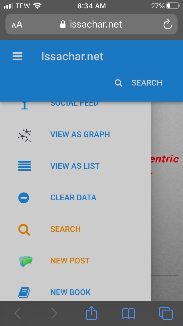
One more point if it is useful- here is a screenshot from iOS/safari: the left nav bar is “stuck” beneath the top ribbon. Any ideas would be appreciated.
I concur that there is a problem here. Though my app in iOS/safari doesn’t have the issue 
It’s seems to be some sort of z-index change of the .app-bar element… maybe.
Though inspecting the page on a desktop doesn’t yield any obvious issues - the mobile view seems to be as expected there.
Thanks @stucork. I also thought z-index might be the issue, though tweaked a few of the settings and have not resolved it yet. I did find this quote from a different CSS reference that makes me wonder if I do not understand all the parent-child relationships in the layout:
But yet another aspect of stacking context is that a child element is limited to the stacking context of its parent.
link:
Ok I got halfway there: I modified this line in standard-page.html:
<div class="nav-holder" style="z-index: 99;"> <!--I added this style element -->
This allows me to click on the buttons on the side navigation on mobile, though the top one is still half hidden.
The only other change I have made from the defult theme.css and standard-page.html is to allow smooth scrolling in CSS:
@media(max-width:998px) {
html:not(.designer) .nav-holder {
display: block;
-webkit-overflow-scrolling: touch;
}