How can I reset the button status to unclicked after clicking it?

I am struggling with a basic question so hopefully there is a quick obvious answer.

I click this basic “next” arrow button that I’ve created:

image

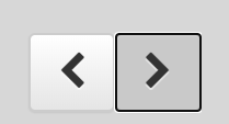
Some kind of state change seems to occur after clicking it and the arrow formatting changes:
image

My mind expects this formatting to flash and then go away after clicking. However, it stays until I click somewhere else on the screen. I am curious how I can make the format go back to the unclicked state right after clicking on it.

Originally, I thought this might be handled with roles, but my theme does not have any button roles. I am confused how this formatting and state change is handled, and do not see any property like this in the button doc. Could you also give me a quick explanation of how this occurs or point me to a resource if it is not too much trouble?

Thanks!

Hi @gweber.lauraandleigh and welcome to the forum.

here’s a related article on the css pseudo selectors that would need targeting.

The native behaviour doesn’t feel intuitive to me either.
Here’s some css that you can add to the bottom of theme.css that should override the default behaviour.

It essentially says - make the focus behaviour the same as not focused but then override hover again so that it gets priority.

.btn:focus {
  background-color: transparent;
}
.btn:hover {
  background-color: rgba(153,153,153,0.2);
}
.anvil-role-primary-color > .btn:focus {
  background-color: %color:Primary 500%;
}
.anvil-role-secondary-color > .btn:focus {
  background-color: %color:Secondary 500%;
}
.anvil-role-primary-color > .btn:hover {
  background-color: %color:Primary 700%;
}
.anvil-role-secondary-color > .btn:hover {
  background-color: %color:Secondary 700%;
}

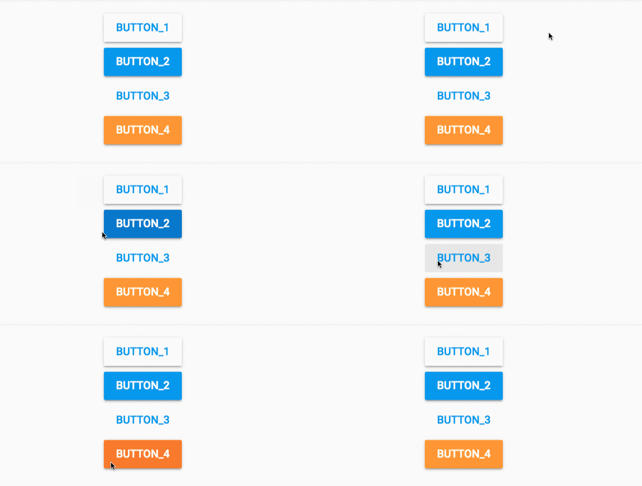
Here’s a gif of the before and after - I do click the buttons! but it’s not so clear with the frame rate of the gif.

Before:

After
nVM36YbLJU

2 Likes

Is it important to distinguish between “clicked” and merely “focused”?

“Clicked” is the state that the button shows while it is being held down.

“Focused” is what shows after the button is released, or when you use the Tab key to highlight the button.

“Focus” tells you which visual element will receive your keystrokes. That’s an important clue that I would not want to hide from my users. It would be like removing the text cursor from a data-entry field. There’d be no feedback as to where the next keystroke is going to go.

1 Like

agree - the above solution could be adapted further to make the focus state different from the hover state.

The unintuitive feel to me comes from the fact that focus and hover are identical in theme.css

compare anvil theme.css to bootstrap…

Anvil theme
Screen Shot 2020-07-07 at 22.20.29

Bootstrap 4
Screen Shot 2020-07-07 at 22.19.43

A better solution might be this then - which can simply be copied to the bottom of theme.css:

.anvil-role-raised > .btn:focus {
   box-shadow: 0 0 0 0.2rem rgba(190,190,190,0.2), 0 2px 2px 0 rgba(0, 0, 0, 0.14), 0 3px 1px -2px rgba(0, 0, 0, 0.2), 0 1px 5px 0 rgba(0, 0, 0, 0.12);
   background-color: transparent;
}
.anvil-role-primary-color > .btn:focus {
  box-shadow: 0 0 0 0.2rem rgb(33,149,243,.5), 0 2px 2px 0 rgba(0, 0, 0, 0.14), 0 3px 1px -2px rgba(0, 0, 0, 0.2), 0 1px 5px 0 rgba(0, 0, 0, 0.12);
  background-color: %color:Primary 500%;
}
.anvil-role-secondary-color > .btn:focus {
  box-shadow: 0 0 0 0.2rem rgb(251,151,2,.5), 0 2px 2px 0 rgba(0, 0, 0, 0.14), 0 3px 1px -2px rgba(0, 0, 0, 0.2), 0 1px 5px 0 rgba(0, 0, 0, 0.12);
  background-color: %color:Secondary 500%;
}

which essentially just adds a slight coloured shadow to the focused button - mimicking the bootstrap version and giving a clear distinction between hover, focus and active

new focused states would be…

Screen Shot 2020-07-07 at 22.40.47

You’d have to adjust the first rgb shadow colour if you had different primary/secondary colours.

2 Likes

Thanks a lot for your help! I probably should have realized this was all working through CSS. For some reason, I was looking for state properties in the button properties.

I should have also mentioned that I was using the “Classic” theme so I am not sure how consistent that is with the main one.

Without me touching the CSS of Classic, the interaction looks like this:
buttons

From the link and examples you’ve provided, I can probably figure out how to get it the way I would like. Thinking about it further and agreeing with you @stucork , I believe the issue for my intuition is that the focus and active/hover look too similar. Bootstrap 4 brings the focus color of the background back to the primary color, which I think is what I expect.

Well anyways, I ended up making a “primary-color” role and added these lines to my theme.css (for Classic theme):

.anvil-role-primary-color > .btn:hover {
  background-color: #ccc;
}

.anvil-role-primary-color > .btn:focus {
  background-color: #fff;
}

.anvil-role-primary-color > .btn:active {
  background-color: #ccc;
}

Not sure if this is the appropriate way but here is the result:
buttons2

Still I am not completely satisfied, but at this point, I think the issue is a deeper conflict between me and CSS. I believe I would like to click (active) and then have it go to hover rather than focus.

Anyways, it led me down a rabbit hole of looking how different buttons operated. If anyone is interested: :upside_down_face:

Windows Explorer

buttonsExplorer
This works the way I would like but isn’t web-based

Facebook Image Viewer

buttonsFacebook
This works well but it muddles up all the different states. Also, the URL changes on each click so I suppose it sends it out of focus back into hover

Google Images


This seems to work decently. However, it has a weird focused step while waiting for the URL to change. Again, the URL change saves the behavior.

I think - If you change the order of your css and put hover at the bottom then this will take priority over focus.

Changing to…

.anvil-role-primary-color > .btn:focus {
  background-color: #fff;
}

.anvil-role-primary-color > .btn:active {
  background-color: #ccc;
}

.anvil-role-primary-color > .btn:hover {
  background-color: #ccc;
}

Leads to…

buttons

It’s almost perfect for me. I would ideally like it to leave focus once I am no longer hovering.

As @p.colbert mentions the focus state says where you are if you hit enter or tab on the keyboard which is potentially important feedback to the user. So removing that state might be misleading…

Yep, I agree with this principle. I was just hoping to not be in the focus state anymore after clicking. Seems like you should not end up in the focus state after the click unless you were in the focus state beforehand (keyboard users). I have been struggling to think of use cases where you want to switch to focus after the click when you weren’t already in it beforehand.

It looks like this Stack Overflow article doesn’t have any satisfactory answers either:
How to remove focus around buttons on click

So I suppose it is what it is :man_shrugging:

1 Like

Just a thought for the keyboard users out there…

If you have just clicked on a button, then, to be consistent with the other web/GUI apps people use, where should the next keystroke go?

Whichever on-screen object that is, should be visibly focused. So maybe the solution is to explicitly set keyboard focus to the desired object, as part of the response to the click. That would take it away from the button.

I think I agree with this idea. In fact, when I was exploring the behavior of different UIs, I noticed MS Word typically did exactly this:

In the gif, I show this with clicking at first and then I jump to using the keyboard (hitting the Enter key and then Shift + Tab, repeatedly).