Hello, I created an app with a horizontal repeating panel but dont know how to modify the column width for mobile display. Would appreciate any help?
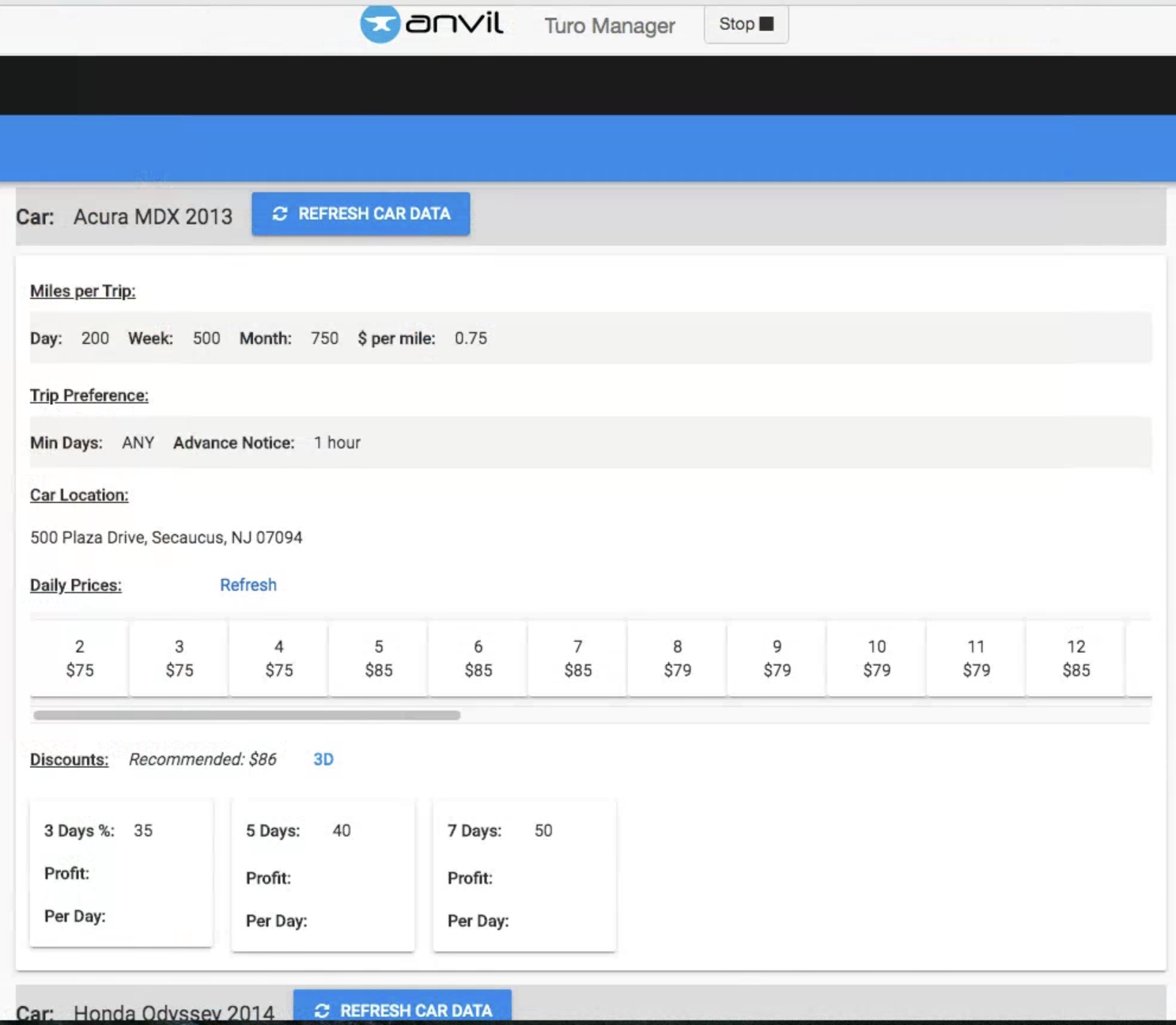
Here is what it looks like in desktop:
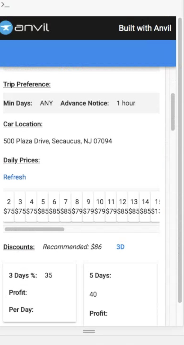
Here is what it looks like in mobile:
Here is a copy of the app for anyone who can help.
App Clone
I just tested this and I presume you want the label in ItemTemplate2 to be a fixed width?
You can achieve this by using an XY panel on the card behind the label and setting the width on the XY panel.
So it looks like you tried the min-width already in css. This would have been what I suggested.
the problem is that it is overriden later with this piece of css in the theme.css
@media screen and (max-width: 768px)
.runner .anvil-panel-col.wrap-mobile {
    min-width: 100%;
}
The easiest win is just to go into itemtemplate2 and set wrap from mobile to never which works for me (since the above piece of css is only active when the template has wrap set to mobile
1 Like
This is much cleaner than the XY Panel!!
*Rick heads off to update code
1 Like