Creating a "rota" system (staff schedule) using the DataGrid

I’m trying to make a ‘Rota’ display whereby I can show essentially a Gantt chart with:

  • Dates in the columns
  • Each person in a row
  • The project name they are working on that day in each cell

I’m unsure the best practice to populate the DataGrid with data from multiple tables.
I have done something similar in the past building a slow and clunky dictionary which read each row and appended a dictionary.

I’ve mocked up some sample data here:
https://anvil.works/build#clone:SCF5WD5ZTYFZAJCV=CN7FHP5GLKFOVV4YJTUJWTLA

What I’m attempting to make this data look like in the DataGrid:
image

Following on from this, I want a project name to span columns if that operative has been on a project for continuous days. This will make the DataGrid more readable for the user and remove the need for duplication:


I am completely unsure how to start this.

Any help on both of the above problems would be much appreciated!

Thanks Anvil Family!

1 Like

Interesting. My two cents having thought about it for a second:

In terms of the visualization itself (not the backend dealings with the DataTables), I might consider approaching this by making a chart, rather than using a DataGrid/table-based visualization.

For example, your second screenshot, looks like a heat map. More specifically,

  • the y axis represents operatives (some nominal value)
  • the x axis represents time (some temporal value)
  • the projects blocks are encoded as nominal colored rectangles, and positioned across x and y accordingly
  • the text “project1”, “project2”, etc, is layered text

This kind of description is consistent with a so-called “grammar of graphics” approach to visualization.

I’m fairly certain that the Altair plotting package (available in Anvil), could make a chart that could represent your data in this way. Maybe you could have a look at the Altair examples to see how you might modify something that looks close. Obviously the following examples are not exactly what you want, but in many respects, they aren’t that far away either.

sc

Anyway, that is just what comes to mind in terms of visualization based on what you shared.

Here’s a quick mock up in Altair:

import altair as alt
import pandas as pd

# sample data
df=pd.DataFrame({ 'operatives': ['a', 'b', 'c', 'b'],
                  'project': ['p1', 'p2', 'p3', 'p1'],
                  'proj_start': [1,1,2,1.5],
                  'proj_end': [3,1.5,4,2]})

operatives project proj_start proj_end
0 a p1 1 3.0
1 b p2 1 1.5
2 c p3 2 4.0
3 d p1 1 2.0

I’ll start with a simplified version to see if I’m on the right track:

base=alt.Chart(df).encode(
    y='operatives',
    x='proj_start',
    x2='proj_end'   
)

bars=base.mark_rect().encode(color='project')
text=base.mark_text().encode(text='project')

bars+text

visualization (1)

Seems close! But it needs some formatting. I’ll modify the above code so that it includes some basic formatting.

base=alt.Chart(df).encode(
    y='operatives',
    x=alt.X('proj_start', scale=alt.Scale(domain=[1,4])),
    x2='proj_end'   
)

bars=base.mark_rect().encode(color=alt.Color('project', legend=None))
text=base.mark_text(dx=30).encode(text='project')

bars+text

visualization (3)

Now that is getting closer! Anyway, you get the idea I’m going for here.

Good luck with your development!

6 Likes

Thank you campopianoa.

Your concepts look good and definitely along the right lines.
I will investigate Altair.

1 Like

I’ve checked out Altair. Its great for visualisation but I’m going to need my system to be interactive and Altair only produces an image so I’m going to have to go down the duplication route to get the interactivity (projects will become dropdowns allowing changes/labour allocation directly on the DataGrid).

So I have managed to get the data into the DataGrid as below:

Code I have used to create the list of dictionaries is fairly significant as I need the dicts reformatting into Operatives (labour). Is there a better way to build the list of dictionaries to populate the grid from multiple data tables?

@anvil.server.callable
def createDataGridRow():
  my_list=[dict(r) for r in app_tables.projectday.search()]  ## search to contain date range eventually
  #print(my_list)
  
  # get PROJECT name from linked table intead of row
  [r.update({'Project': r['Project']['ProjectName']}) for r in my_list]
  #print(my_list)
  
  # get LABOUR names from multi-linked table
  for d in my_list:
    my_nested_dicts=[dict(person) for person in d['Persons']]
    d.update({'Persons': my_nested_dicts})
  #print(my_list)
  
  # empty list for labour names
  labLIST = []
  
  # all operatives names into a list (remove dupilcates)
  for r in my_list:
    for row in r.get('Persons'):
      if row['Labour'] not in labLIST:
        labLIST.append(row['Labour'])
    
  # empty list for rows
  labour_rows = []
  
  # create the list of dictionaries for each man(labour)
  for man in labLIST:
    labour_rows.append(dict(name = man))
  #print(labour_rows)
  
  WD1 = date(2020, 2, 15)
  WD2 = date(2020, 2, 16)
  WD3 = date(2020, 2, 17)
  WD4 = date(2020, 2, 18)
  WD5 = date(2020, 2, 19)
  WD6 = date(2020, 2, 20)
    
  
  for man in labour_rows:
    checkName = man['name']
    for row in my_list:
      for item in row['Persons']:
        if item['Labour'] == checkName:
          if row['WorkingDay'] == WD1:
            dt = "1502"
          elif row['WorkingDay'] == WD2:
            dt = "1602"
          elif row['WorkingDay'] == WD3:
            dt = "1702"
          elif row['WorkingDay'] == WD4:
            dt = "1802"
          elif row['WorkingDay'] == WD5:
            dt = "1902"
          elif row['WorkingDay'] == WD6:
            dt = "2002"
          
          # day is the key DDMM , project is the value
          man[dt] = row['Project']

  print (labour_rows)
  
  return labour_rows

Project clone:

https://anvil.works/build#clone:SCF5WD5ZTYFZAJCV=CN7FHP5GLKFOVV4YJTUJWTLA

Any thoughts on the duplication issue would also be appreciated. In essence I would like a project to span the dates when it is consecutive as per my original post mock-up.

Thanks.

I haven’t taken a close look but I just wanted to mention that one of Altair’s primary strengths is interactivity (including binding data to dropdowns and other widgets). It may not be the best solution here but I thought I would mention that in case you were not aware. I often even combine Anvil components (e.g., dropdown) with Altair for filterering or piping data from DataTables to the plot. One thing that is currently not possible in Altair I believe, is returning selections (interactions within the plot) back to the user (either to the clipboard, a variable, or exported in some way). As long as that is not needed, Altair should work fine as far as I can tell. Certainty there are plenty of choices out there though.

Thanks, do you have an example you would be able to share?

Sure, here is a thread that shows how to use Altair in Anvil.

There is also a how-to guide in the docs:

https://anvil.works/docs/how-to/plot#bokeh-altair-and-pygal

2 Likes

I’ve had a look at your server code. Here’s a version that simplifies the process of generating the list

@anvil.server.callable
def createDataGridRow():
  
  labour_dict = {operative:{"name":operative["Labour"]} for operative in app_tables.person.search()}
  # use the operative table row as a key

  for project_row in app_tables.projectday.search():
    dt = project_row['WorkingDay'].strftime("%d%m")
    # get the date in the form 1602

    for operative in project_row['Persons']:
      labour_dict[operative][dt] = project_row['Project']['ProjectName']

      # update the labour_dict 
      # {operative_row1:{"name": "operative1", "1602":"Project1"},
      #  operative_row2:{"name": "operative2"},
      #  ...
      # }

  return list(labour_dict.values())

1 Like

That’s brilliant Stu. Thank you.
I knew my logic could be improved but wasn’t sure where, I am still fairly new to python/anvil (3-4 months experience) and its a steep learning curve.

no worries, I thought about your other question a little bit… i.e. to make duplicates span across multiple columns in a datagrid.

idea:

  • put Labels on the DataRowPanel and bind the labels.text property to self.item["1602"] etc…
  • in the code for the DataRowPanel you could change the background colour of each label depending on the Project.
  • You could even use a data binding for the background color.

proof of concept

https://anvil.works/build#clone:PPJBJQMOSUHWGJKP=OBDZM3ODGDWXQQ7Y5YXH7YQ7

it’s not perfect… could be more dynamic… and would need some css to remove the padding between columns… but…

Data binding for the background colour is exactly what I have been experimenting with:

The colour identifiers certainly help. Also, I am likely to be using large project names which will be in a format (project ref (6 numbers). client (approx 10-15 characters), project name (10-15 characters)) similar to:
000000 - Client Name - Project Name
This will likely span greater than the size of a single DataGrid column and become unmanageable without a merge (for now it will have to be just project numbers or perhaps project name until I can come up with the merge method).

1 Like

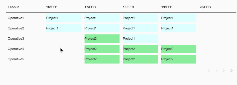
You could use popovers so that when you hover over the project label name you get more info…

Implementing Popovers (floating forms)

from popover import popover

...

self.label_1602.popover(content = Label(text=f'Project: {project}\nClient: {client}\nRef: {ref}'),
                        trigger = "hover")

1 Like

If I understand correctly, that will make for a lot of dropdown components, and if they cannot span multiple columns (like a Gannt chart does), then many of the dropdowns will be doing the same thing (I think). Do you think it would look cleaner if you separated the visualization of the staff schedule from the act of editing it?

That is,

  • Have a Gannt chart that is simply a view of the current project assignments (it can have zooming, panning, tooltips, and other interactive features). Use whichever visualisation library you prefer.

  • Have a separate small “admin” interface for editing projects. For example, perhpas you could simply have two dropdowns: one for projects, one for staff members. Those could work together as an “admin” interface for editing, creating, and removing projects. When you change the project data, the chart refreshes.

Something conceptually similar to this in the sense that there are standard Anvil components driving an interactive chart. Your app would look different of course but you can see how the visualization and the act of editing its input data are separated out.

ezgif.com-gif-maker (1)

I believe your app would be much easier to build and maintain this way, and your staff schedule would be easier to read if I understand things correctly.

1 Like

Hello,

You can now create a Gannt chart with Plotly if you would like to go that route.

Please see here for a clonable example.

Also, Plotly figures can register click events back to the user, therefore, two-way interactivity is possible using standard Anvil techniques. For example, something like this shows clicked data being sent back to the user, which can then be updated.

Please see here for more details on how to identify the clicked data in a Plotly chart.

This seems like a very promising way to accomplish what you’ve requested as you now have a nice combination of a grid style display that is actually a two-way interactive chart.

5 Likes