Clickable DataGrid headers

I am trying to make some column headers in a DataGrid clickable in order to sort by column.

I have:

  • unchecked the auto_header property of the DataGrid, so the default header is not shown
  • added a DataRowPanel item above the RepeatingPanel
  • checked its bold and pinned properties
  • added self.header_row.item = {'col1': 'Header 1', [...]} to form.__init__
  • added a link to the DataRowPanel columns that I want to make sortable
  • made the link bold
  • added to the link_col1_click handler the code to sort the DataGrid content

At this point everything works fine, with the exception of two things:

  • the rows_per_page counts the header row as one of the data row. The workaround is easy: add 1 to the desired number of rows
  • the thick line under the header is missing. The workaround is… ?

All the forms in the app have several DataGrids. Only 1 of about 20 DataGrids needs sortable column headers.

How do I get the DataGrid with custom headers to look like the other DataGrids?

Here is the customized DataGrid next to a standard one, in a page with 3 more DataGrids, all looking like the one on the right:

1 Like

Not sure about the rows per page but the border you should be able to sort with a role that adds a border to the bottom of the data row.

I am not at my computer at the moment but will post the role tomorrow.

2 Likes
  1. on datagrid uncheck auto_header
  2. drag datarowpanel component to top of datagrid
  3. drag links into the columns on datarowpanel
  4. add click event handlers to do whatever you need
  5. optional (give datarowpanel a role that contains ‘border-bottom:2px solid black’)

https://anvil.works/build#clone:S6B5TQPNSTNP2YAU=ECVJ6JD27RXFOBISFIUDX3YV

6 Likes

Thanks @joinlook for the help!
Could you please help me in getting same thing but in code?
I do not know how to set row template for header after disabling the auto-header.

dg = DataGrid()
dg.columns = [{"id":0,"title": 'column_1', "data_key": 'column_1'},
                 {"id":1, "title": 'column_2', "data_key": 'column_2'},
                 {"id":2, "title": 'column_3', "data_key": 'column_3'}]
dg.auto_header = False
rp = RepeatingPanel(item_template=DataRowPanel)
rp.items = self.data
dg.add_component(rp)
self.add_component(dg)

If you want to do it from code, you could look at the DataGridJson custom component.

Right now I don’t remember how it does it, but I do remember that it is possible to make a column sortable, hence clickable.

Let me know if you don’t understand how the code works, and I will have a look at it and try to help.

1 Like

Thanks for the help! I used DataGridJson multiple times and I tried to go through the code but could not get that part. I need to add checkbox beside each header name but not sure how to do it (it should be done in code as well). I would really appreciate if you can help me in that. Thanks!

I had a quick look at the source code, and I think that this little summary includes all the steps.

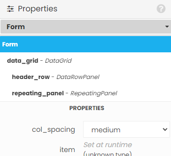
The DataGridJson custom component starts with a form containing a DataGrid. The DataGrid contains one DataRowPanel above the usual RepeatingPanel.

image

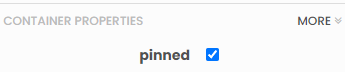
The DataRowPanel is the container for the links that will act as clickable headers. It is pinned, so it will be visible also on page 2 and the following pages:

image

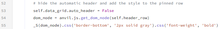
The code sets its style and disables the automatic header (otherwise you get both the automatic and the pinned header):

It is populated from code, either with Labels or with Links:

The DataGrid will contain one more row than requested so the RepeatingPanel shows the requested number of rows, because the first one is taken by the pinned header row:
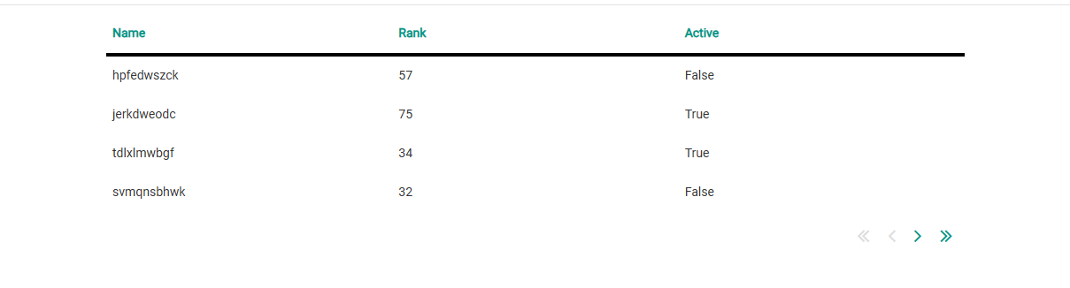
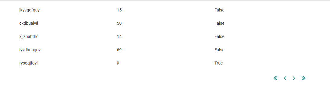
image

2 Likes

This is great! I’m surprised Anvil didn’t have this functionality out of the box.