So, first of all, loving the new editor: it’s awesome.
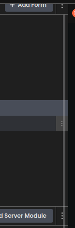
One thing that I noticed, though is that the Three-dots option button, which allows you to add forms, modules, packages, etc. is overlapping with the overflow bar, which makes it difficult to click on it:
It would be great if there was a right margin for the button so that the overflow always be to the right of it (or other fix, I don’t know).
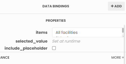
I wasn’t able to expand the text area to edit the items of a dropdown:
I appreciate the thin scroll bar in Chrome and the thin draggable corner in the text area, but when they get too thin and overlapping, they are unusable.