This may not be a bug, but it’s bugging me, so I thought I would share my thoughts here.
The component list shows the name and the class of the component. I love it!
- Standard components show the class name, like
LabelorFlowPanel, and it’s clear. - Custom components show a mystery prefix before the class name, like
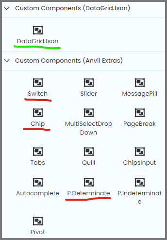
D.DataGridJson,UNKNOWN.ChipandU.P.Determinate. I don’t understand what theDis for, perhaps it’s short for the name of the dependencyDataGridJson, but it is not clear.
And I don’t understand why some components from Anvil Extras have the UNKNOWN prefix and some have the U prefix.
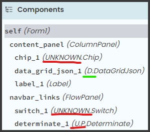
These are full class names:
anvil.Label
anvil.FlowPanel
DataGridJson.DataGridJson.DataGridJson
anvil_extras.Switch.Switch
anvil_extras.Chip.Chip
anvil_extras.ProgressBar.Determinate.Determinate
Perhaps the intent was to shorten the prefix to one letter, but if that is the case:
-
UNKNOWNshould never appear - I’ve noticed an app where custom components from different dependencies had the same prefix letter (not sure, I don’t remember which app and can’t check now)
Sooo…
If this is a bug, then we will wait for a fix.
If this works as expected, then I would like to raise a flag to say that in my opinion this is neither intuitive nor pretty.
EDIT
I get it now!
The dependency name is shortened to its first letter when the full text exceeds a certain length!
UNKNOWN.Chip fits with its full prefix, while U.P.Determinate gets only the initials for its long module names, and shows its full name in the tooltip.
So this does explain the behavior. It would be nicer to see anvil_extras, rather than UNKNOWN, but now I understand it.
Still, I now know this is not a bug, but the problem remains:
- The behavior is not intuitive
- If you have two dependencies with the same initial, that prefix is useless
Sooo…
A prefix that is inconsistent (short vs long names), useless (when dependencies have the same initial) and unintuitive seems still wrong to me.
Perhaps the tooltip and a symbol to distinguish between standard and custom components would do the job more nicely.