Please make the Properties panel more consistent.
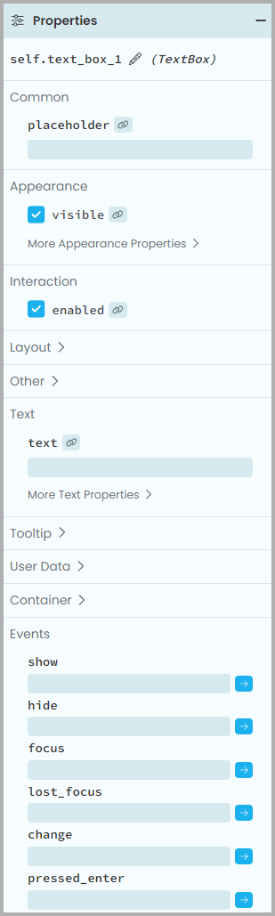
The attached snapshot shows the properties of a TextBox, where:
- Clicking on Layout, Other, Tooltip, User Data and Container expands or collapses as expected
- Clicking on Appearance and Text expands or collapses their “More properties” subsection
- Clicking on Common, Interactions and Events does nothing
I don’t see any reason why only some of the section without subsections shouldn’t collapse.
I understand why clicking on sections with subsections expands or collapses their subsection only, but it’s inconsistent and not intuitive (and ugly).
Clicking on any of the headers should always expand or collapse.
Sections with sub sections should have a more visible clickable header, or, better, shouldn’t exist. Each subsection should be promoted to its own section. Then, since we have already decided that we will add buttons to expand or collapse all sections  , it will be easy to collapse all, then click either on “Text” or on “More Text”.
One additional request: I would like to be able to collapse all the panels. I can click on the + of the 3 panels Add Components, Properties and Components, I end up with 3 -, and they all will share the available real estate.
But if I click again on the -, I don’t know what happens. Sometimes the panel above opens, sometimes the panel below, even if I didn’t click on it. This can be confusing. It would be better to only open the panel that I explicitly want to open.
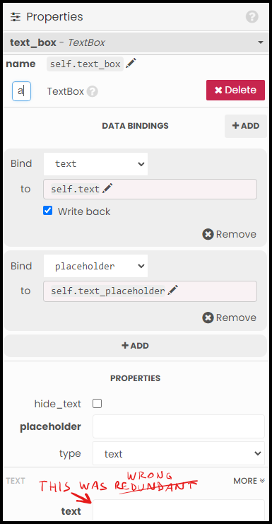
The old designer was showing all the databinding properties at the top of the Properties panel. This was creating an inconsistency, because below the databinding definitions there was the UI for the properties that were defined already with databinding.
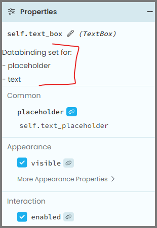
The beta designer is more consistent: each property tells you whether there is databinding or not.
I appreciate the improvement in consistency, but I miss being able to see what properties have databinding at a glance. I can scroll up and down, looking for blue databinding icons, but it is not as easy to find all the databinding, plus, since we don’t have (yet) the expand all button, I may need to manually go through all the section headers and expand them all before scrolling up and down through all the properties.
I don’t know what a good solution would be, but I know that I miss having the full list of databinding at the top. Perhaps a solution could be keeping all as is now, and adding a summary of all databinding at the top? Something similar to this?
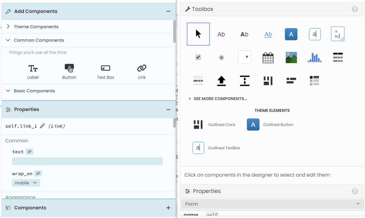
 for data bindings, I’d go back to something different (like in the Classic) for the Link “Add Component” icon.