Basic Components
This is a list of the basic components available in Anvil.
The properties and events for each component are listed in the API Reference.
You can also find out about a component’s properties and events by creating one in the Anvil Editor and examining it in the Properties Panel. Hover your mouse over the name of each property or event for more information.

Hover your mouse over a property to see more info.
Scrolling a component into view
Anvil provides a scroll_into_view() method on each component, which scrolls the screen to bring that component into view:
  def form_show(self, **event_args):
    # Scroll button1 into view
self.button_1.scroll_into_view()show event handler, rather than its init method.Button 
This is an Anvil button.

Drag and drop a Button onto your Form, or create one in code with the Button constructor:
b = Button(text="This is a button")Label 
Labels are useful for displaying text on a Form. The user cannot edit text in a Label.

c = Label(text="This is a label")Link 
Links allow users to navigate to different parts of your app, or to other websites entirely. If a Link’s url property is set, it will open that URL in a new browser tab.

c = Link(text="This is a Link",
         url="https://anvil.works")
self.add_component(c)
If a Link’s url property is not set, it will not open a new page when it is clicked. It will, however, still trigger the click event.
c = Link(text="Click me")
c.add_event_handler('click', ...)
If a Link’s url property is set to a Media object, it will open or download that media in a new tab.
m = anvil.BlobMedia('text/plain', b'Hello, world!', name='hello.txt')
c = Link(text='Open text document', url=m)
You can Link to another Form by setting the click event handler to run open_form on an instance of the Form you want to open.
def link_1_click(self, **event_args):
  """This method is called when the link is clicked"""
  form1 = Form1()
  open_form(form1)
Making any component clickable using a Link
A Link is a container and inherits from the column panel, which means it can contain other components. This allows you to make any component clickable by putting it in a Link
and creating an event handler for the Link’s click event. This is a similar principle to surrounding something in
an <a> tag in HTML.
CheckBox 
A CheckBox allows a boolean choice - checked or unchecked.
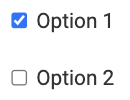
c1 = CheckBox(text="Option 1", checked=True)
c2 = CheckBox(text="Option 2", checked=False)
A CheckBox can support a third state, checked=None, also known as indeterminate.

c3 = CheckBox(text="Option 3", checked=None, allow_indeterminate=True)When a user interacts with a CheckBox the state will toggle between checked=True and checked=False. The checked=None state can only set in code or with a databinding. If allow_indeterminate is not set to True then checked=None is equivalent to checked=False.
RadioButton 
RadioButtons force users to select exactly one option from a list.
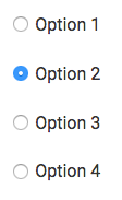
rb1 = RadioButton(text="Select this option")RadioButtons can be divided into groups by setting the group_name property. The user can select one option from each group.
(If you don’t set group_name, then all your radio buttons will be in the default group.)
You can either find out each individual RadioButton’s status by accessing the selected property, or you can call
the get_group_value() method to find out which button in that group is pressed. (get_group_value() will return
the value property of the currently selected RadioButton in that group. If there are multiple RadioButtons in the
same group with the same value, then you can’t tell them apart this way!)
rb1.group_name = "mygroup"
rb1.value = "A"

rb2 = RadioButton(text="Or select this one", group_name="mygroup", value="B")

# Add these radio buttons to the Form
self.add_component(rb1)
self.add_component(rb2)

rb1.selected = True
print(rb1.get_group_value())  # prints A

rb2.selected = True # This will deselect the other button
print(rb2.get_group_value())  # prints B
DropDown 
This is an Anvil drop-down.

Drag and drop onto your Form, or create one in code with the DropDown constructor:
# Create a DropDown

b = DropDown(items=["Item 1", "Item 2"])
The items property can be a list of strings (["One", "Two", "Three"]), or a list of 2-tuples ([("First Option", 0), ("Second Option", 1)]).
If you use a list of strings, the selected_value property always returns the currently selected string.
If you use a list of 2-tuples ([("First Option", 0), ("Second Option", 1)]), the first element of each tuple is displayed in the drop down box. When an item in the DropDown list is selected, the second element of the tuple becomes the selected_value property of the DropDown.
This is particularly useful if you wish to, for instance, choose from a list of Data Table rows:
# Assuming the "people" table has at least columns "name" and "age":

self.drop_down_1.items = [(r["name"],r) for r in app_tables.people.search()]

# Later, probably in the DropDown 'change' event handler:

row = self.drop_down_1.selected_value
self.lbl_name.text = row["name"]
self.lbl_age.text = row["age"]
If you set the DropDown’s include_placeholder property to True, then the drop-down will display an extra option. That option corresponds to a selected_value of None. So the following code will display “Choose a person…”, in addition to whatever items you have specified:
self.drop_down_1.include_placeholder = True
self.drop_down_1.placeholder = "Choose a person..."
self.drop_down_1.selected_value = None
DropDown items are updated in the UI when the items property is set or updated using the = operator. If you’re using append to construct a new items list, run the = operator to make the change live:
# Construct a list of items
self.drop_down_1.items = []
for lunch in ['burger', 'burrito', 'bolognese']:
  self.drop_down_1.items.append(lunch)

# Make the new list live in the UI
self.drop_down_1.items = self.drop_down_1.items
In the Anvil Editor, DropDown items can be set in the Properties Panel. Each item shoud be on a separate line.
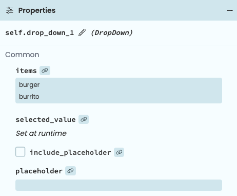
Setting DropDown items in the Properties Panel
DatePicker 
The DatePicker allows users of your app to select dates and times from a drop-down calendar.

c = DatePicker()The date property allows you to get and set the displayed date. Whatever you set it to, it will
always return a datetime.date or datetime.datetime object, depending on the value of the pick_time
property. You may set the date property in any of the following ways:
- To a string in the format specified by the
formatproperty - To an ISO8601-formatted date
- To a
datetime.dateobject - To a
datetime.datetimeobject (ifpick_timeisTrue) - To the string
"now", causing the DatePicker to display the current time when it is loaded.
c = DatePicker(format="%d %m %Y")

# Set to a string
c.date = "27 09 2016"

# Set to an ISO string
c.date = "2016-09-27"

# Set to a datetime.date
import datetime
c.date = datetime.date.today()

# Set to a datetime.datetime
c.pick_time = True
c.date = datetime.datetime.now()
The min_date and max_date properties can be set in the same ways.
When the pick_time property is True, date expects and returns a datetime.datetime object.
Otherwise it expects and returns a datetime.date object.
When selecting times, the returned datetime.datetime object has its timezone (tzinfo)
explicitly set to the timezone of the user’s browser. Read more about timezones in Anvil here.
Set a DatePicker to have focus by calling its focus() method. Select all its text with the select() method.
focus() and select() methods should be called from its show event.TextBox 
TextBoxes allow users to edit text on your Forms.

c = TextBox(text="Some editable text")A TextBox can only accept a single line of text. If you want to accept multiple lines of input, use a TextArea
Set a TextBox to have focus by calling its focus() method. Select all its text with the select() method.
focus() and select() methods should be called from its show event.The type property of a TextBox is a hint to the browser, which may constrain or suggest how to edit a text box (for example, only allowing digits in a number TextBox, or displaying a dial-pad when editing a tel TextBox).
When a TextBox’s type property is set to "number", its text property will always return either a number or None.
The text property of a TextBox can trigger write-back of Data Bindings. This occurs before the lost_focus and pressed_enter events.
TextArea 
TextAreas are text boxes that can contain multiple lines of text.
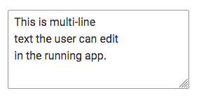
c = TextArea(text="Some editable text\nacross multiple lines")Set a TextArea to have focus by calling its focus() method. Select all its text with the select() method.
focus() and select() methods should be called from its show event.The text property of a TextArea can trigger write-back of Data Bindings. This occurs before the lost_focus event.
Timer 
The Timer raises its tick event repeatedly, waiting a specified length of time in between each event.
Set the interval property to specify the wait time in seconds.
c = Timer(interval=0.1)This allows you to run a particular piece of code repeatedly (for example, updating an animation).
To stop the Timer, set interval to 0:
# Stop self.timer_1 from raising its tick event
self.timer_1.interval = 0
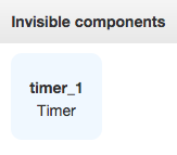
The Timer is an invisible component, meaning that users will not see it on the page when you run the app.
Spacer 
Spacers add empty space to a Form.

Use them to fill a column with blank space, or to make vertical space on your Form.
c = Spacer(height=50)Image 
Image components display an image on a Form.
To manipulate images, see the Image module.
c = Image(source="http://www.example.com/image.jpg")You choose which image to display in an Image Component by setting its source property. If this is set to a string, the image will be loaded from a URL given by that string.
Alternatively, you can set the source property form the Properties Panel by clicking the upload button and selecting an image from your machine. This will add the picture to your App’s assets and set the component’s source to the asset file URL.

You can also work with images in code using Media objects. For example, Google Drive files are Media objects, so you can display an image from Google Drive directly in an Image component.
c.source = anvil.google.drive.app_files.my_image_jpgIf you read the source property of an Image, you will always see a Media object, even if you set it to a string. (Anvil automatically generates a URLMedia object for that URL.)
FileLoader 
A FileLoader allows you to load files from your computer or mobile device into an Anvil app.

c = FileLoader()The currently selected file in a FileLoader can be accessed from the file property. It is a Media object, so you can use it to display images, upload files to Google Drive, and so on.
if c.file != None:
    self.my_image.source = c.file
The files attribute gives a list of files. If the multiple property is set to True, then multiple files may be loaded; otherwise this list will always either be empty or contain one element.
The FileLoader’s change event is raised when a user selects a file. Its file argument is a Media object containing the chosen file.
  def file_loader_1_change(self, file, **event_args):
    """This method is called when a new file is loaded into this FileLoader"""
    # Display this file in an Image component
    self.image_1.source = file
The file is loaded into the user’s browser; it does not get sent to the server side automatically. You can pass it into a server function to get it into a Server Module (since it is a Media object, it will be streamed):
  def file_loader_1_change(self, file, **event_args):
    # Upload the selected file into a Server Module
    result = anvil.server.call('my_image_classifier', file)
You can also store it in a Data Table:
  def file_loader_1_change(self, file, **event_args):
    # Upload the selected file into a Data Table
    app_tables.my_files.add_row(name=file.name, media_obj=file)
To reset the FileLoader and make it ready to receive more files, call its clear() method.
c.clear()YouTube video 
You can display YouTube videos with the YouTubeVideo component.
ytv = YouTubeVideo(youtube_id="cbP2N1BQdYc", autoplay=True)YouTube videos can be paused, played and stopped using the pause(), play() and stop() methods.
You can get and set the current position of the YouTube video using current_time.
There is a state_change event that gets raised when the video is paused, played or stopped.
Do you still have questions?
Our Community Forum is full of helpful information and Anvil experts.
