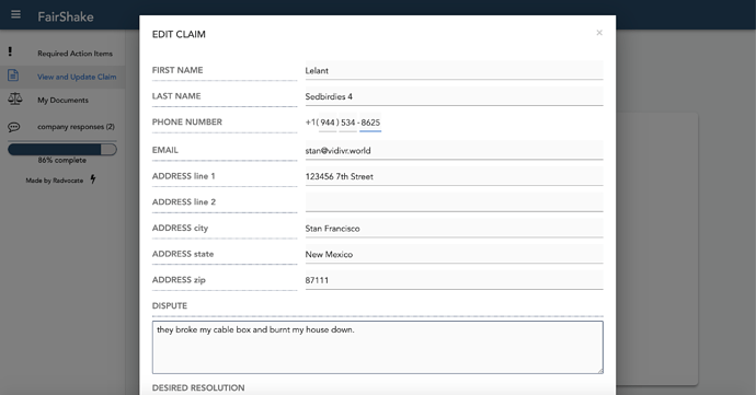
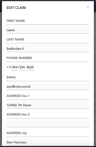
for mobile display, grouping components vertically in Column Panels scales to fit any screen nicely, but can sometimes look awkwardly wide on PC. A way to get around this is to place components that should be next to eachother on a wide screen side by side in a column panel, so if screen is wide they appear properly but if screen is narrow the one on the right goes underneath the one on the left. For example:
If you want to have one design for mobile and one design for desktop, you could measure the screen and available space by putting this into a custom html component and calling the function with self.call_js(‘measure_screen’). If w<h, display the mobile optimized forms. if w>h display desktop optimized forms.
<script>

  function measure_screen(){
  var w = screen.width
  var h = screen.height
  var aw = screen.availWidth
  var ah = screen.availHeight
  return {
        w: w,
        h: h,
    	aw:aw,
    	ah:ah
    };

  };

</script>
