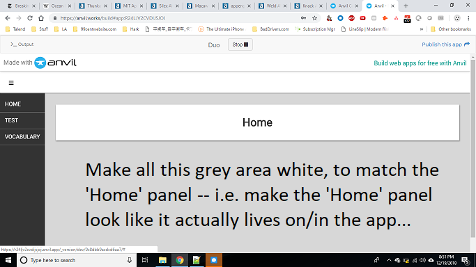
II have a test app - something like Duolingo – I’m curious how to make the main content window less blocky. That is, how to make the main content window just extend all the way to all edges, instead of appearing as a block of content with a dropshadow?
To get the background colour you want, you can modify the HTML and CSS that makes up the app in Assets.
Here I’ve changed the background-color of .body to be white, and removed the drop-shadow on the .card. I’ve also made the .nav grey so it’s distinguished from the white background.
If you want things in Content Panels to stretch to the edges of their containers, check the full_width_row box under Container Properties.
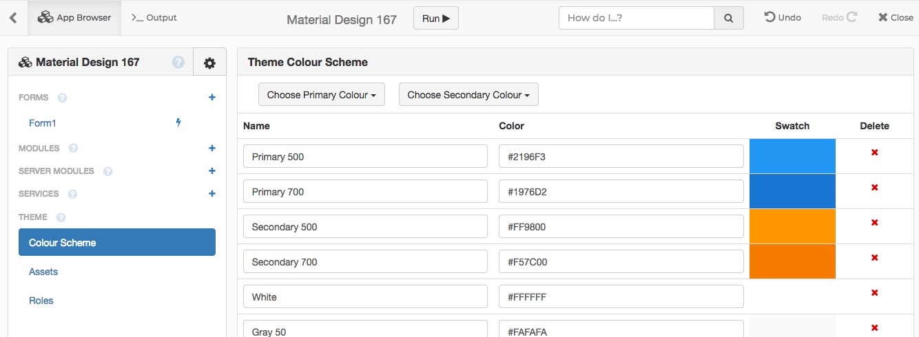
I’d recommend using the Material Design theme, it’s like the classic theme but a bit neater and more configurable. If you don’t like the blue-orange-and-white colour scheme it comes with, you can modify it using Colour Scheme under Theme (and you can completely modify the HTML and CSS as well).