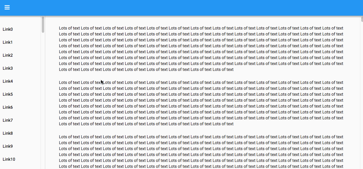
The default Material Design app main page has a tall panel on the left, usually used for navigation tools (e.g., buttons, outlines, etc.), and a wide panel on the right, usually used for specific “pages” within the app. Both share a single scrollbar at the right.
Is there a way to give each one its own scrollbar, e.g., as with Firefox’s bookmarks pane? This would allow random access to the menu/outline at the left, no matter how many lines it contains, while still keeping the contents of the panel at right also visible (to retain context for the user).
I suspect that the issue is one of growth. In our app, the outline at left starts out with only a few visible entries, and gets taller as some of the outline entries get expanded. Eventually it gets taller than the initially-allotted space.
In fact, the outline entries themselves are not initially part of the panel, but are added (once) early in the form’s lifetime.
Problem solved! @p.colbert’s app was created before the scrollbar in the sidebar was added to the theme. By adding a line to theme.css, his app gets a scrollbar.
Specifically,
.nav-holder {
  flex-grow: 1;
}
becomes
.nav-holder {
  flex-grow: 1;
  overflow-y: auto;
}
(Apps don’t auto-update as we improve the theme.css because you can edit that file yourself, so we don’t want to give you conflicts to deal with.)