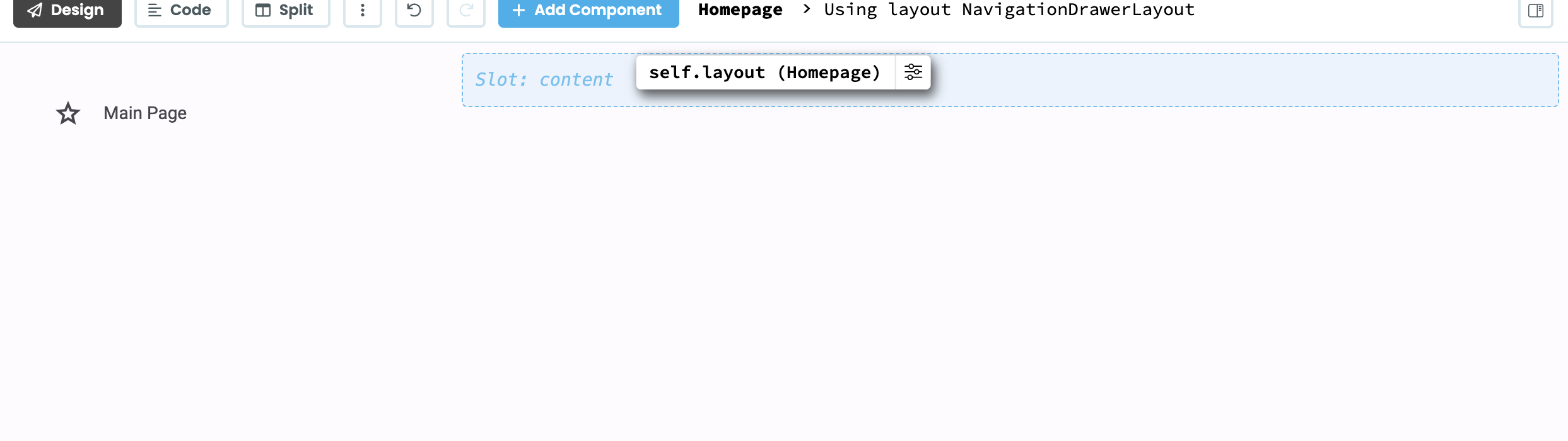
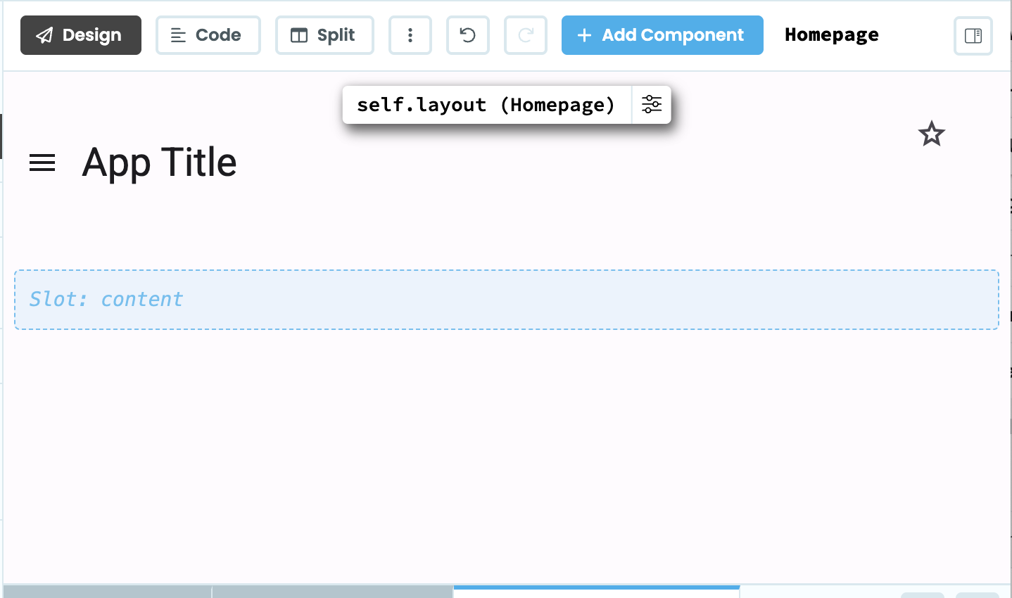
The same behaviour is followed when I preview the published app - large window size, no title, drawer icon, or right-corner icons. Shrink the browser width down and they all appear.
Is this something I’m doing wrong, or something quirky with the layout template?
The layout was built this way to follow M3 specs which had a different layout on mobile vs desktop screens. However, M3 has changed a lot of their specs since this was built and the Navigation Drawer is now deprecated.
We need to update how layouts work so they meet the new specs and are actually usable! There is an issue for this on the M3 Github repo.
I presume in that case @brooke - would it would be better to start again and use the NavigationRailLayout, or should I just hold off using the M3 Beta layouts for now? (I’m starting some new projects at the mo hence deciding what to work with)