Hi there,
I’m trying to style Anvil extra’s multiselect dropdown, which is by the way awesome, just like Anvil’s standard dropdown. Though the following role doesn’t do too bad in copying the design from the standard dropdown, I still have some issues…
.anvil-role-multiselect {
  font-size: 16px;
  font-weight: bold;
  background-color: %color:Surface Variant%;
  color: %color:On Surface Variant%;
  box-shadow: none;
  border-bottom: 1px solid %color:Outline%;
}
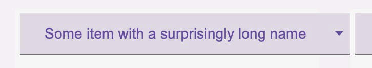
The biggest issue:
As you can see on the picture, choosing a long item results in something bigger than its container. I experimented with setting in the UI-designer the width to 100%, fit etc. None of them looked right, though.
Edit: I am just seeing that it is rather difficult to see that the dropdown exceeds its white container. But it does ![]()
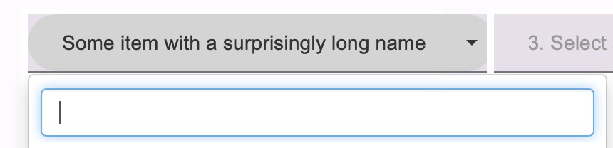
The smaller issues(s):
When hovering over the dropdown, it is getting a little darker (nice!), but its edges are very round and don’t match the overall pattern. Which property do I need to change to make it look normal? Same goes with the background color of the opened drop down. The standard is white. I am hoping to set it to the Gray of the normal dropdown.
Asking this question here and not on Github was hopefully OK.
Thanks - Arne