I needed a small project to decompress, and there’d been some interest in a star rating custom component that supported input, so I put some time into creating it. It no doubt doesn’t support all the features everyone would want, but it gives a starting point for people to customize.

Ratings can be set via code to half amounts, but the user can only set ratings on whole amounts.
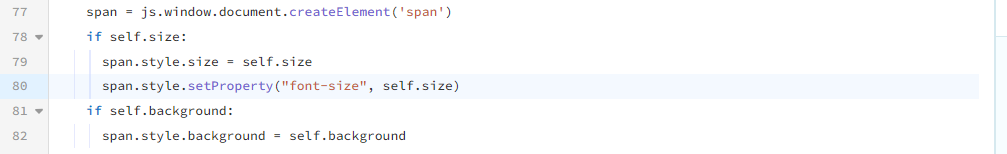
The component can be set to editable or not, and the size and color of the stars and background is customizable.
https://anvil.works/build#clone:425FR24FERWHALKB=EWDTFUKRCE5AENAIYCC6MTEE
Credit goes to @robert for the original code to display star ratings via Font Awesome icons: Star ratings with icons!
Disclaimer: I don’t normally create custom components based on forum posts, this just happened to coincide with a need of mine.