I need to change the background color of a checkbox before & after it has been checked.
But I cannot find it in the theme.css asset.
I have also searched the docs & found this Anvil Docs | anvil
I could also not find anything in the forum that assisted.
But still don’t know how to reference it in the css.
Usually it would be:
.checkbox > input {
background-color: #some color;
}
I also tried to find a solution to this but ended up with a workaround- using checkbox icons in slink and changing the foreground colour. Not ideal but works.
@rickhurlbatt The obstacle is the browser’s default checkbox styles.
Try this. But I still can’t set the width & height. Still working on it.
.checkbox input {
  -webkit-appearance: none;
  background-color: #f00;
}
1 Like
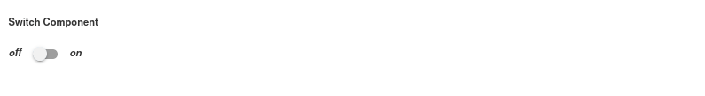
You might consider using the switch component of the anvil extras library which is based on a standard checkbox element but looks like this:
2 Likes
Thanks @owen.campbell I saw that.
I’m busy doing a custom design for a client. Unfortunately he doesn’t want the switch component for the checkbox
@rickhurlbatt if you want to set the width & height remove the padding from the input css
width: 14px !important;
height: 14px !important;
border-radius: 1px;
display: inline-block;
position: relative;
2 Likes
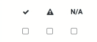
Here is a clip of what it looks like when you have three check boxes, and three icons and you programmatically hide and show them depending on what is selected. The header row shows the three options for the columns. This way you can have any colour icon for the selected option (ie red for warning, a green tick which hasn’t shown up in the GIF etc). @owen.campbell would this be something valuable for Anvil Extras?
1 Like
Thanks @rickhurlbatt I’ll remember this one