Remove responsiveness in datagrid / repeating panel

What I’m trying to do:

I have a standard datagrid with repeating panel. When viewed on a mobile it stacks (just as it should) but it looks ugly. Plus, it’s quite a complex row of data. I want to just have it display as it does on desktop, ie. all in one line with the user being able to zoom in and out and drag around on their phone.

What I’ve tried and what’s not working:

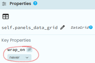
I’ve tried pretty much everything. I have looked at other Q&A’s on here and tried those solutions but they don’t work for me. I have worked with ChatGPT and Gemini for some hours but I got nowhere. I have set all wrap on settings to never, I have put the grid in a card, outside of a card, set the columns to “expand”… I think I have tried everything through the UI

Simply put, I don’t want any responsiveness at all on my grid. Is it even possible or is Anvil not able to selectively drop the responsiveness?

Thanks.

Have you set wrap_on to never?

Make sure you do the same for the datagrid and its containers.

image

Thanks, yes I have tried that. I have also been to every Wrap On and tried setting them to never as well… every combination.

I have tried putting the grid in a card and set that to wrap_on: never.

I have also tried having the grid just in the normal screen space, set to never and full_width_row.

The structure is that I have a content panel (set to never), inside it is the datagrid (set to never). The repeating panel does not have a wrap option.

… what about the form itself?

A form is a container too and it has the wrap_on property as well.

Hi @cezaroscan,

I think at this point it would be helpful if you could share a clone link demonstrating the issue, so we can see concretely what you’re trying to achieve and what results you’re getting instead. If it’s part of a proprietary app, what I would suggest is simulating the issue - create a new blank app, add a DataGrid, fill it with dummy data until it’s looking nasty on small screens. Then make that app cloneable, and others can take a look!

Hi. My apologies for the late response, I was on annual leave.

Stefano, I am sure I have set wrap to never on the form itself. I am at the highest point in the hierachy and it is “never”.

Meredyyd, I have attached two screenshots showing what it looks like now. The normal view gives the standard desktop style output, ie. long horizontal lines of date. The mobile view then “responsives” (is that a word?) the output to fit on/stack for mobile. I don’t want this reformatting in this case. Hopefully that helps describe my issue. If you need, I can build a dummy app to show the same.

What I am trying to achieve is to simply have the mobile output display in a horizontal line, with no responsivesness at all, in effect the same output as the desktop version, then the user can zoom in and scroll around with their finger on mobile. I could achieve this in normal html/js/php by setting the meta viewport, eg.

<meta name="viewport" content="width=1200"/>

The above would then force the data output to be tiny on a mobile but better suited for my needs.

Please ask any further questions.

Thank you, Cez.