Plotly: figure.add_trace(..) not working (double scatter graph)

Hi guys,
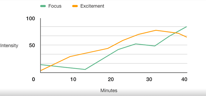
I’m trying to add a simple double-scatter graph with two-sets of y-data for the same x-data.
The desired result is something like:

I’m following the documentation for plotly.graph_objects and using the ‘fig.add_trace()’ method as described in the docs. (plotly.graph_objects.Figure — 5.8.1 documentation)

You can see below my codebase, which follows this exactly (There is also the commented code above which is my actual data, but I wanted to simplify to show the error)

The issue I’m having is an error TypeError: 'WrappedObject' object is not callable on line 102 (The first line with ‘fig.add_trace(go.Scatter())’)

Seems like theres some mismatch between plotly.graph_objects on anvil and the actual library. Can anyone shed any light?

Much appreciated:)

Code Sample:

    data_journeys = anvil.server.call('get_journeys_data')
  
#     my_fig = go.Figure()
#     line1 = go.Scatter(x = [d['Minutes'] for d in data_journeys],
#                         y = [d['FocusLevel'] for d in data_journeys],
#                         name = "Focus",
#                         mode = "lines")
#     line2 = go.Scatter(x = [d['Minutes'] for d in data_journeys],
#                         y = [d['ExcitementLevel'] for d in data_journeys],
#                         name = "Excitement",
#                         mode="lines")
#     my_fig.add_trace(line1)
#     my_fig.add_trace(line2)
    
#     my_fig.update_layout(xaxis_title="Minutes", yaxis_title="Intensity")


    fig = go.Figure()
    fig.add_trace(go.Scatter(x=[1,2,3], y=[2,1,2])) 
    fig.add_trace(go.Scatter(x=[1,2,3], y=[2,1,2])) 
    self.plot_journeys_2.figure = fig
    return
*** SOLVED ***

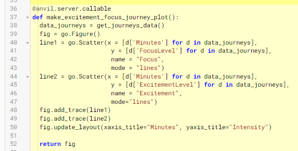
The solution was to create a server-side function which returns the figure, and assign the figure to the appropriate plot in the client-side.

SERVER SIDE
image

CLIENT SIDE

4 Likes

#This Program is working good

from ._anvil_designer import Plot_FormTemplate
from anvil import *
import plotly.graph_objects as go
import anvil.server
from plotly import graph_objs as go

class Plot_Form(Plot_FormTemplate):

def init(self, **properties):
# You must call self.init_components() before doing anything else in this function
self.init_components(**properties)

# This example is taken straight from the official Plotly
# documentation: https://plot.ly/python/line-charts/

# Add data
month = ['January', 'February', 'March', 'April', 'May', 'June', 'July',
        'August', 'September', 'October', 'November', 'December']
high_2000 = [32.5, 37.6, 49.9, 53.0, 69.1, 75.4, 76.5, 76.6, 70.7, 60.6, 45.1, 29.3]
low_2000 = [13.8, 22.3, 32.5, 37.2, 49.9, 56.1, 57.7, 58.3, 51.2, 42.8, 31.6, 15.9]
high_2007 = [36.5, 26.6, 43.6, 52.3, 71.5, 81.4, 80.5, 82.2, 76.0, 67.3, 46.1, 35.0]
low_2007 = [23.6, 14.0, 27.0, 36.8, 47.6, 57.7, 58.9, 61.2, 53.3, 48.5, 31.0, 23.6]
high_2014 = [28.8, 28.5, 37.0, 56.8, 69.7, 79.7, 78.5, 77.8, 74.1, 62.6, 45.3, 39.9]
low_2014 = [12.7, 14.3, 18.6, 35.5, 49.9, 58.0, 60.0, 58.6, 51.7, 45.2, 32.2, 29.1]

    
# Create and style traces
trace0 = go.Bar(
    x = month,
    y = high_2014,
    name = 'High 2014',
    line = dict(
        color = ('rgb(205, 12, 24)'),
        width = 1)
)
trace1 = go.Bar(
    x = month,
    y = low_2014,
    name = 'Low 2014',
    line = dict(
        color = ('rgb(22, 96, 167)'),
        width = 1,)
)
trace2 = go.Scatter(
    x = month,
    y = high_2007,
    name = 'High 2007',
    line = dict(
        color = ('rgb(205, 12, 24)'),
        width = 1,
        dash = 'dash') # dash options include 'dash', 'dot', and 'dashdot'
)
trace3 = go.Scatter(
    x = month,
    y = low_2007,
    name = 'Low 2007',
    line = dict(
        color = ('rgb(22, 96, 167)'),
        width = 1,
        dash = 'dash')
)
trace4 = go.Scatter(
    x = month,
    y = high_2000,
    name = 'High 2000',
    line = dict(
        color = ('rgb(205, 12, 24)'),
        width = 1,
        dash = 'dot')
)
trace5 = go.Scatter(
    x = month,
    y = low_2000,
    name = 'Low 2000',
    line = dict(
        color = ('rgb(22, 96, 167)'),
        width = 1,
        dash = 'dot')
)
self.plot_1.data = [trace0, trace1, trace2, trace3, trace4, trace5]

self.plot_1.layout = dict(title = 'Average High and Low Temperatures in New York',
              xaxis = dict(title = 'Month'),
              yaxis = dict(title = 'Temperature (degrees F)'),
)