Hi there,
I should start by stating that I am neither a developer or a coder, but I had an idea and with copious amounts of help from ChatGPT I have created a working app.
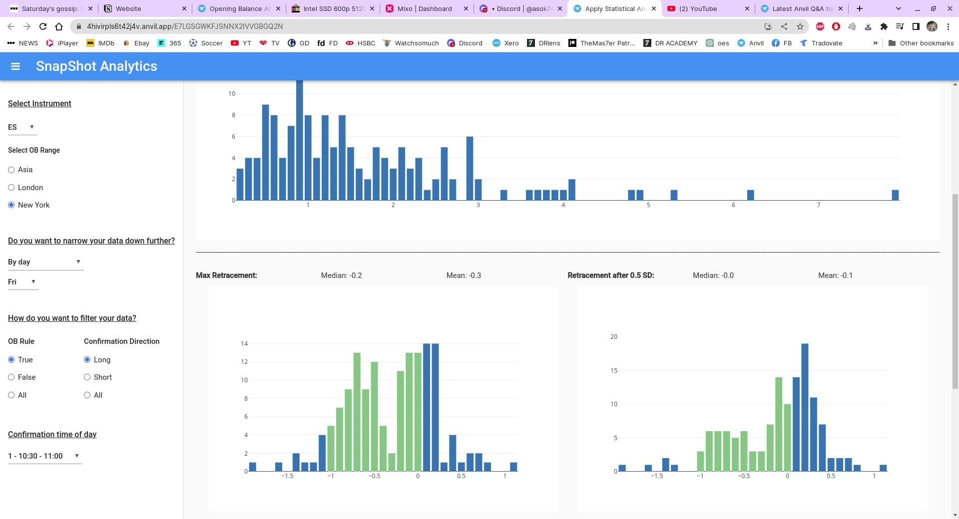
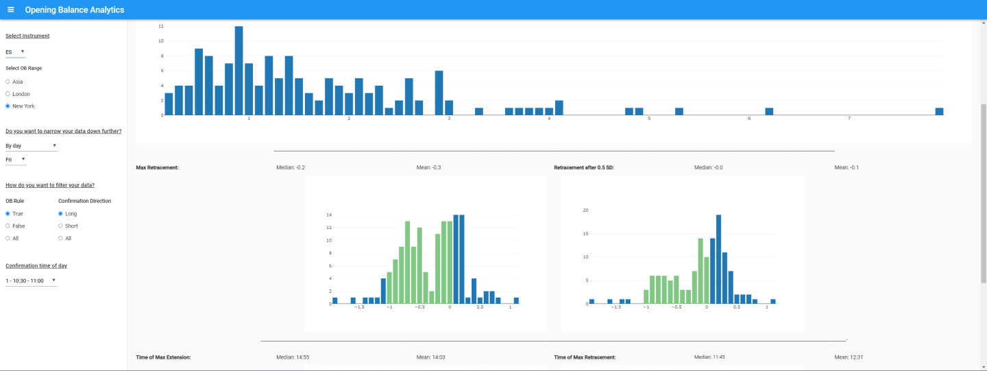
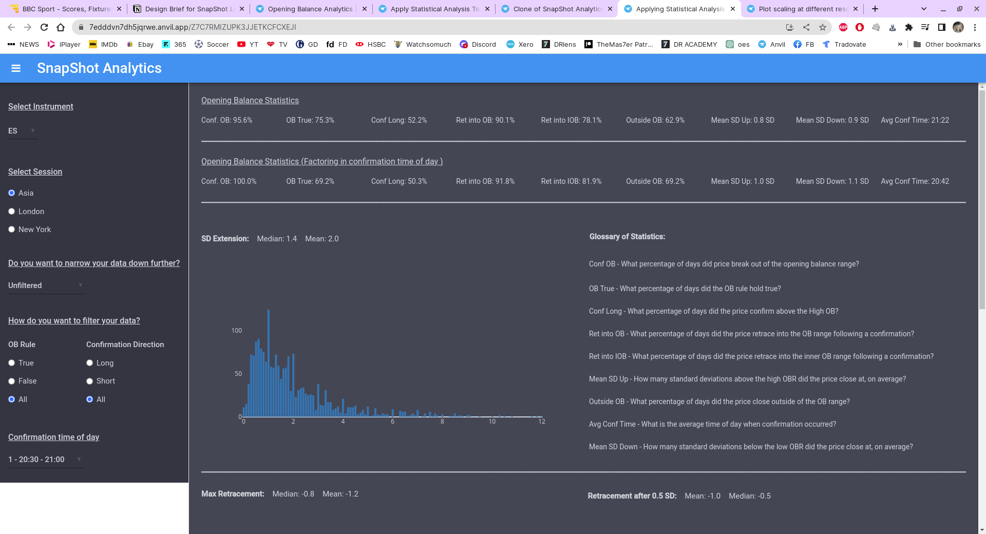
I have an app that displays statistical and bar chart data from a database and am having a bit of difficulty when viewing the app at different resolutions on different monitors.
Below are 2 screenshots the first is the app displaying at a resolution of 1920 x 1080 and the second on a widescreen with resolution at 2560 x 1080. As you can see the results on the widescreen are undesirable. I’m wondering if I’ve made a mistake somewhere in the design section. Anybody got any ideas?
Yes it was set to true, but they were in a flow panel. I think I’ve solved it now by taking them out of the flow panel, but the only downside to that is that there’s no seperation between the graphs now. I can’t seem to find away to seperate them. Could do with a vertical spacer similar to the horizontal one or something like that. I tried an x,y panel, but couldn’t get that to work. At least they bahave on the widescreen monitor now though.
They should have a width or height property (integer) you can set directly, in the IDE or by code, so you should be able to set them all to the same integer value.
I figured that’s probably the case, but I’m a novice at this and can’t actually write code. I guess you can accomplish quite a lot with just drag and drop, but once it get’s down to the fine detail being able to code is essential really.
In this case, you should be able to find the parameter in the Properties panel at the right of the IDE, no coding required.
The panel has a few “accordion” sections. It’s usually in the bottom section. You might have to expand it. You might have to scroll the panel down to see that section.
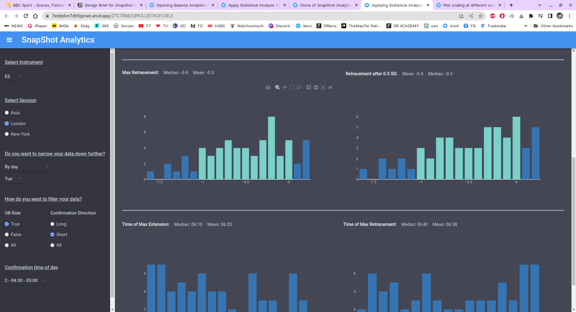
Well, the original problem was because the plots were in a flow panel, when the app ran on a widescreen monitor, even though the flow panel and the plots therein were set to full width, they wouldn’t take up the whole width. So, I found that by taking them out of the flow panel and inserting them directly they would work, but there was no dilineation between the plots and they kind of knitted together. So, I was able to insert a spacer between them I could manually set the width of the spacer by sliding the handles, which worked and would seperate the plots. But, you can only set the spacers wdith by using the handles, you can’t punch in a measurement in the properties the way you can for the height. So, that’s all good, however I had 2 rows of 2 charts and when I tried to do the same thing with the row of charts below I couldn’t get the spacer to the same width, it was either slightly too large or slightly too small, which meant the charts above didn’t line up with the charts below (or at least 2 of them didnt).
Anyway, how I’ve now overcome this is to change the background colour of the plots to the same colour as the form, so you don’t notice that they are kintted together due to the uniform colour. I had planned to ultimately change the colour of the app to make it easier on the eye and fortunately it also solved this problem. I’m sure there would have been an easier way to do it if I knew what I was doing.
I like this seamless-background approach! I’ll keep it in mind to simplify my own work, when I need to put multiple plots on the same Form.
Tip: if you anticipate having to print out these pages (e.g., to show to others, away from a computer), dark backgrounds can eat ink and toner like crazy. Having a light-colored option can save money and trips to the office supply store.
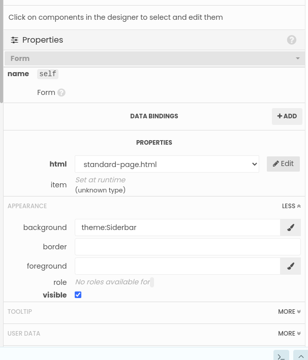
Would you happen to know how I can over come this issue. If you look in the bottom left corner you’ll see a white box, this is the space below the sidebar. As the sidebar doesnt contain as much data as the main page the side bar only goes 2/3rds of the way down. Before I changed the background colours it wasn’t an issue because everything was white. If you click on that area the name in properties is ‘self’ ‘form’, which is also the same for the main page. You have appearance properties, but no matter what you put in the ‘background’ colour box it remains white. I can overcome it by placing a spacer in the inserted column panel and increasing it’s size until the white disappears, but it’s not an ideal solution as, depending on your monitors resolution, it will then produce a slider between the sidebar and the main page.
In the properties section here. If I click on the white area this is the properties it brings up. As you can see I’ve inserted the colour I created in the background box and even tried it with hex and RGB colour codes, but it has no effect.