What I’m trying to do:
I am trying to replicate an existing dashboard which is currently built in Google Data Studio, with multiple charts and multi-select dropdowns (from anvil-extras).
However I am getting pretty confused having to manually code all of the data interactions, and I’m not sure that I have structured this is a particularly logical way, so any guidance would be most appreciated please. I can’t share the app as it needs to access private data, but the basic flow I’m trying to build is:
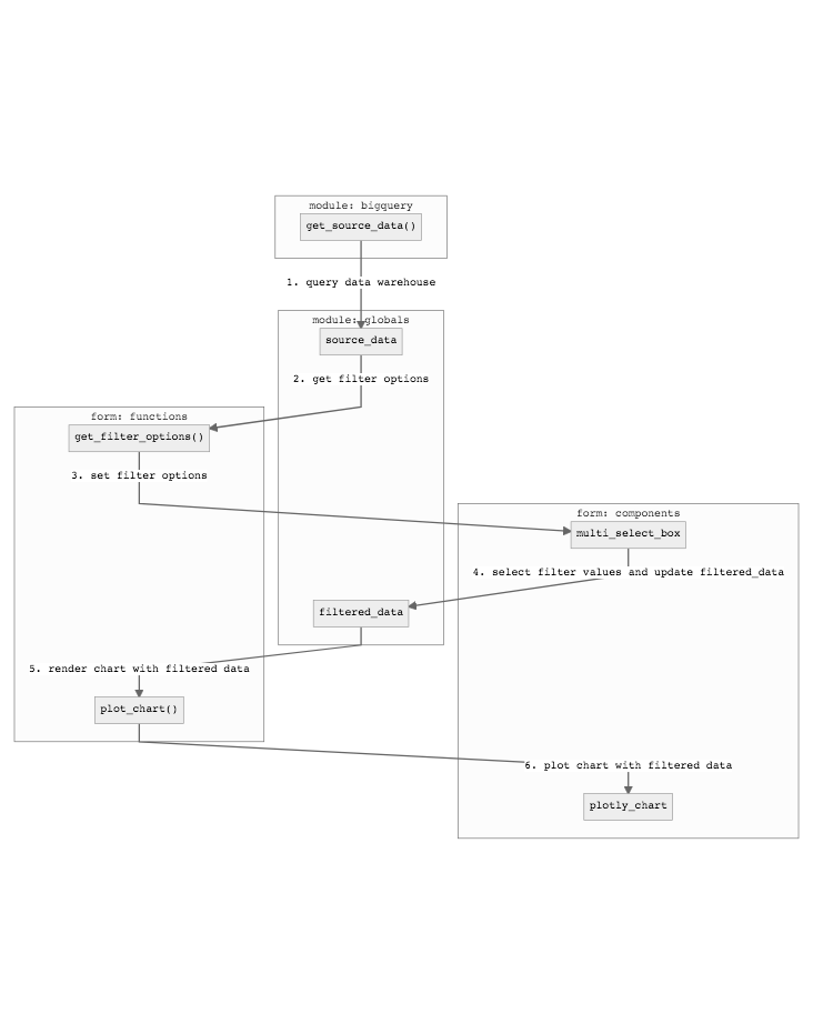
However I think I might be over-complicating things as it seems absurdly complex to have to build all of this for a simple filter (I also need multiple dynamic filters but am starting with the simplest case). I’m hoping there’s a much simpler solution as this is making my brain hurt. Thanks!