Hi guys,
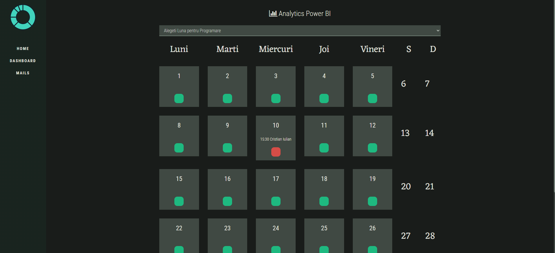
I have a bad situation. I have to make an scheduling app for someone. On my laptop it seems very nice like this:
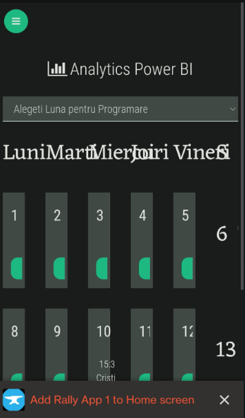
But on my phone is like this:
I tried to get everything to don’t wrap on mobile but it looks the same.
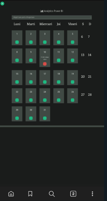
I want to look like this: (I enabled desktop view on my mobile)
But i don’t want my client to do this every time when he enters the app.
Please guys help me with this, i need this for my first freelance ideea and i wanted to start with anvil because i hate design and front end.
And if you have a better ideea on how i can do this calendar more efficient i would appreciate.
Thanks!
If I were tackling this, I’d look at wrapping a js library - probably https://fullcalendar.io
1 Like
I would look for a permanent solution, like @owen.campbell provided.
However, you could do something like this:
1 Like
Hi @danniel.tanc,
It looks like what’s happening, when your phone chooses “Desktop View”, is that it’s effectively zooming out - it’s making the text smaller, the padding and margins between elements smaller, and so on.
You can do this yourself, using CSS. If you’re not familiar with it, @Brooke has written up a handy guide to using CSS in Anvil which can introduce you to the basics. I’d also suggest you look into Media Queries, which are the way to create CSS rules that only apply on screens of certain sizes (eg only shrinking the text/padding/margins/etc on mobile devices)
1 Like