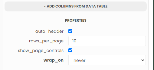
Trying to make my datagrids more mobile friendly. I am using html which was stock anvil code, with some adjustments. I want all the columns to come across on the phone as being the same as they are with any screen size. I want them fixed across rather then wrapped. I unselected wrap on the actual datagrid and am using the below html. I hope someone can help.
What I’ve tried and what’s not working:
Code Sample:
<!DOCTYPE html>
<html>
<head>
  <meta name="viewport" content="width=device-width, initial-scale=1.0">
  <link href="https://fonts.googleapis.com/css?family=Roboto:300,400,500" rel="stylesheet" rel="preload" as="font" crossorigin="anonymous">
  <style>
    /* Mobile-friendly styles */
    html, body {
      margin: 0;
      padding: 0;
      height: 100%;
    }

    .structure {
      display: flex;
      flex-direction: column;
      min-height: 100vh;
    }

    .app-bar {
      display: flex;
      align-items: center;
      justify-content: space-between;
      padding: 10px;
      border-bottom: 1px solid #ccc;
      position: fixed;
      top: 0;
      left: 0;
      right: 0;
      background-color: #fff;
      z-index: 999;
    }

    .title {
      text-align: center;
    }

    .app-bar-nav {
      text-align: right;
    }

    .nav-holder {
      position: relative;
      flex: 1;
      overflow: hidden;
    }

    .left-nav {
      position: absolute;
      top: 0;
      left: -100%;
      width: 80%;
      height: 100%;
      transition: left 0.3s ease;
      background-color: #f1f1f1;
    }

    .nav-shield {
      display: none;
    }

    .content {
      padding: 10px;
      margin-bottom: 50px;
      overflow-x: auto;
    }

    /* Add a home button */
    .home-button {
      display: flex;
      align-items: center;
      justify-content: center;
      height: 30px;
      width: 30px;
      background-color: #f1f1f1;
      border-radius: 50%;
      margin-right: 10px;
    }

    /* Media query for smaller screens */
    @media screen and (max-width: 480px) {
      .left-nav {
        width: 100%;
      }

      .nav-shield {
        display: block;
        position: fixed;
        top: 0;
        left: 0;
        width: 100%;
        height: 100%;
        background-color: rgba(0, 0, 0, 0.5);
        z-index: 1;
      }

      .app-bar {
        flex-direction: column;
        align-items: flex-start;
      }

      /* Adjust the position of the home button */
      .home-button {
        margin-top: 10px;
        margin-right: 0;
        margin-left: 10px;
      }

      /* Ensure table columns do not wrap */
      .table-container table {
        table-layout: fixed;
        width: 100%;
      }

      /* Prevent table header cells from wrapping */
      .table-container th {
        white-space: nowrap;
      }
    }
  </style>
</head>
<body>
  <div class="structure">
    <div class="app-bar">
      <div class="title">
        <!-- Add your banner content here -->
        <h1>Banner Content</h1>
      </div>
      <div class="app-bar-nav">
        <!-- Add your banner buttons here -->
        <a href="