Is it possible to reproduce this behavior of the text field labels / placeholders in Anvil?
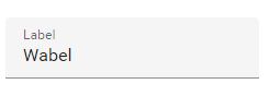
I would like to avoid hardcoding the text field labels into the form, and still follow the Material Design guidelines
Is it possible to reproduce this behavior of the text field labels / placeholders in Anvil?
I would like to avoid hardcoding the text field labels into the form, and still follow the Material Design guidelines
Welcome to Anvil.
Out of the box, no. But when I get a moment later I’ll see if I can create a custom component to do that.
Hi @renrengabas, and welcome to the forum!
Here’s a clone link to an app with a custom component, ‘TextBoxWithPlaceholder’, that reproduces the behaviour you were looking for.
https://anvil.works/build#clone:MIQOXAY2UEYTRRTB=LTAU6XJ3JWON2X2NTF7VYKME
Let me know if you have any more questions 
Apologies for beating you to it, @david.wylie!
Ok, here’s a slightly different take on it using some javascript to perform the animations.
No where near as Anvillic as @bridget’s one, and probably fragile, but what the hell, I offer it up for sacrifice
https://anvil.works/build#clone:6IL6SQTPPFVVRVQP=FFFUPS4QXFCQG7AOHT5C37LC
Wow, that was quick. Thanks! Will definitely check it out
Hi @bridget,
Your solution works great for me. I’ve even standardized it into a component that can accept also accept Form Validation.
https://anvil.works/build#clone:VZN53VSXBEWTGGVN=5JENX6MTKLUQGWW7PPY567J6
I just have one question: How did you manage to make the top and bottom spacings tight?
Best regards,
Ren²
@renrengabas glad to hear it!
I tweaked some of the padding in the App’s CSS to adjust the spacings:
/* You can find this around line 30 in theme.css  */
.anvil-label>.label-text, a>.link-text {
  padding-top: 0px;  /* change from 8px to 0px */
  padding-bottom: 0px; /* change from 8px to 0px */
}
...
/* You can find this around line 646 in theme.css  */
input.anvil-component, .anvil-component select, .anvil-datepicker input {
  padding: 0px 0 4px;  /* change from 8px 0 4px to 0px 0 4px */
  border: 0;
  border-bottom: 1px solid rgba(0,0,0,0.42);
...
}
I’d like to resurrect this one. The demo works fine but, given that this is part of the M3 guidance, it would be far better to have roles for a text box to include this behaviour.
Specifically, I’d like to see the label text (presumably, the placeholder text in anvil terms) on both ‘Filled’ and ‘Outlined’ roles behaving as described at Text fields – Material Design 3
I could probably work my way through this and get something working…
but I’d still rather see it built in.