Welcome to the Forum, @08435855!
You can style a button to achieve this using Roles. Create a Role and assign it to your Button - I’ve gone with circle-button. Clear all text from the button and assign it the fa:plus icon - or whatever icon you want.
Then in theme.css (which can be found in Assets), add these CSS rules (inspired by this snippet):
.anvil-role-circle-button > .btn {
  font-family:Verdana, Geneva, sans-serif;
  font-size:18px;
  background-color: %color:Secondary 700%;
  /* Alternatively, this is the 'reddish-orange' colour in Google Calendar: */
  /*background-color: #db4437; */
  color:white;
  position:fixed;
  width:60px;
  height:60px;
  bottom:40px;
  right:40px;
  border-radius:50px;
  text-align:center;
  margin-top:22px;
  /* 2dp */  box-shadow: 0 2px 2px 0 rgba(0, 0, 0, 0.14), 0 3px 1px -2px rgba(0, 0, 0, 0.2), 0 1px 5px 0 rgba(0, 0, 0, 0.12);
}

.anvil-role-circle-button > .btn:active {
  /* 8dp */ box-shadow: 0 8px 10px 1px rgba(0, 0, 0, 0.14), 0 3px 14px 2px rgba(0, 0, 0, 0.12), 0 5px 5px -3px rgba(0, 0, 0, 0.2);
}
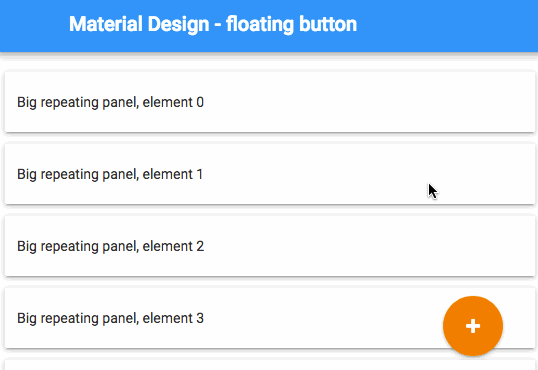
Add the button anywhere on the page - it’ll appear in the bottom-right of the Design view and you can select it there when you want to modify its properties and assign event handlers (you might need to scroll down a bit to see it).
Result:
Here’s a clone link for the example app:
https://anvil.works/ide#clone:FXOGMXELYLGMFOFP=S4BQH32LK3FFPM6Z5OZQUWW3