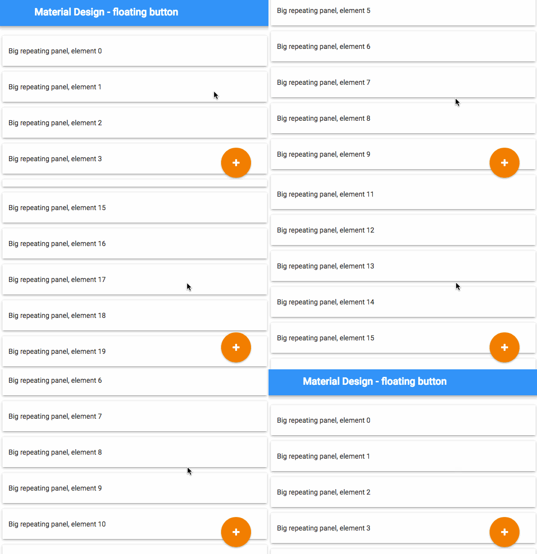
One popular element of material design is the circular button floating on the bottom right that is usually used for adding/composing (e.g. Google Calendar and Inbox). Is there a pre-rolled component for this function in anvil (I can’t find one, nor find an easy way to change a button element to do this).
Welcome to the Forum, @08435855!
You can style a button to achieve this using Roles. Create a Role and assign it to your Button - I’ve gone with circle-button. Clear all text from the button and assign it the fa:plus icon - or whatever icon you want.
Then in theme.css (which can be found in Assets), add these CSS rules (inspired by this snippet):
.anvil-role-circle-button > .btn {
  font-family:Verdana, Geneva, sans-serif;
  font-size:18px;
  background-color: %color:Secondary 700%;
  /* Alternatively, this is the 'reddish-orange' colour in Google Calendar: */
  /*background-color: #db4437; */
  color:white;
  position:fixed;
  width:60px;
  height:60px;
  bottom:40px;
  right:40px;
  border-radius:50px;
  text-align:center;
  margin-top:22px;
  /* 2dp */  box-shadow: 0 2px 2px 0 rgba(0, 0, 0, 0.14), 0 3px 1px -2px rgba(0, 0, 0, 0.2), 0 1px 5px 0 rgba(0, 0, 0, 0.12);
}

.anvil-role-circle-button > .btn:active {
  /* 8dp */ box-shadow: 0 8px 10px 1px rgba(0, 0, 0, 0.14), 0 3px 14px 2px rgba(0, 0, 0, 0.12), 0 5px 5px -3px rgba(0, 0, 0, 0.2);
}
Add the button anywhere on the page - it’ll appear in the bottom-right of the Design view and you can select it there when you want to modify its properties and assign event handlers (you might need to scroll down a bit to see it).
Result:

Here’s a clone link for the example app:
https://anvil.works/ide#clone:FXOGMXELYLGMFOFP=S4BQH32LK3FFPM6Z5OZQUWW3
Love this Shaun. I’m wondering if you can tell me how to just have one color to the button, without any hover or click effects. In my app the button click triggers another component to be added to the form. once clicked, the button color remains at its grey color until I click off somewhere else. That does not occur in the app you shared here and I don’t understand the difference (same CSS).
I have tried fooling with the CSS but can’t make a dent.
well, this works to keep the button a single color through most of its states. But clearly, I’m not very good with CSS as this seems a bit much.
.anvil-role-circle-button > .btn {
  font-family:Verdana, Geneva, sans-serif;
  font-size:18px;
  background-color: %color:Secondary 700%;

  color:white;
  position:fixed;
  width:60px;
  height:60px;
  bottom:40px;
  right:40px;
  border-radius:50px;
  text-align:center;
  margin-top:22px;
  box-shadow: 0 2px 2px 0 rgba(0, 0, 0, 0.14), 0 3px 1px -2px rgba(0, 0, 0, 0.2), 0 1px 5px 0 rgba(0, 0, 0, 0.12);
}

.anvil-role-circle-button > .btn:visited {
  color:white;
  box-shadow: 0 8px 10px 1px rgba(0, 0, 0, 0.14), 0 3px 14px 2px rgba(0, 0, 0, 0.12), 0 5px 5px -3px rgba(0, 0, 0, 0.2);
  background-color: %color:Secondary 700%;
}

.anvil-role-circle-button > .btn:focus {
  color:white;
  box-shadow: 0 8px 10px 1px rgba(0, 0, 0, 0.14), 0 3px 14px 2px rgba(0, 0, 0, 0.12), 0 5px 5px -3px rgba(0, 0, 0, 0.2);
  background-color: %color:Secondary 700%;
}

.anvil-role-circle-button > .btn:hover {
  color:white;
  background-color: %color:Secondary 700%;
  color:white;
}

.anvil-role-circle-button > .btn:active {
  color:white;
  box-shadow: 0 8px 10px 1px rgba(0, 0, 0, 0.14), 0 3px 14px 2px rgba(0, 0, 0, 0.12), 0 5px 5px -3px rgba(0, 0, 0, 0.2);
  background-color: %color:Secondary 700%;
}
That’s strange about the button remaining grey in your app. I woulid have thought removing the rule for .anvil-role-circle-button > .btn:active would remove the only hover/click effect, but apparently not in your case.
CSS tip: if you want the same rules to apply to multiple selectors, you can separate them with a comma:
.anvil-role-circle-button > .btn:active, .anvil-role-circle-button > .btn:focus, .anvil-role-circle-button > .btn:visited {
  color:white;
  box-shadow: 0 8px 10px 1px rgba(0, 0, 0, 0.14), 0 3px 14px 2px rgba(0, 0, 0, 0.12), 0 5px 5px -3px rgba(0, 0, 0, 0.2);
  background-color: %color:Secondary 700%;
}
Ahh, great. Thanks so much Shaun.
Hi Shaun
I think I may be missing something obvious here. I created the role and edited the theme.css. Back on the form I dropped a button, changed its role to circle-button, removed text, applied icon fa:arrow-up and set the click event handler to scroll to the top.
When run on my laptop this works fine but back in the designer the button floats under other components. Worse still when I run the app on my phone the button floats beneath other components all the time. Any ideas?
Hi @nickm.booth - you would do better to ask a new question than bump a 6 year old thread (referencing someone who no longer works at Anvil).