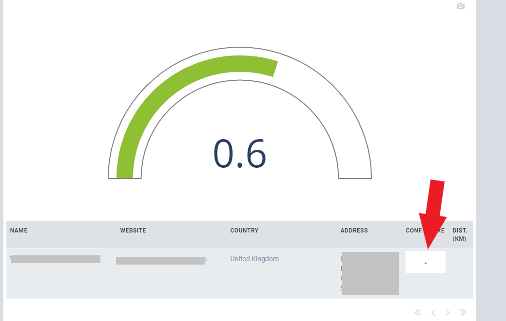
I am currently trying to show a plot within a data grid, which works fine so far. However, some issues occur in terms of plot size and layout. My plot is something like this:
def get_confidence_score_graphic(score):
  fig = go.Figure(go.Indicator(
  mode = "gauge+number",
  value = score,
  domain = {'x': [0, 1], 'y': [0, 1]},
  gauge = {
        'axis': {'range': [None, 1], 'tickwidth': 1, 'tickcolor': "darkblue", 'visible': False},
        'bar': {'color': "#8FBF33"},
        'bgcolor': "white",
        'borderwidth': 2,
        'bordercolor': "gray"
  }))
  return fig
When I plot it somewhere else than the data grid it always fits and auto-sizes to the predefined space. However, when the same plot is used in the data grid, the graphic itself is very small (even on the downloaded plot), no matter which predefined width or height of the column/plot I use. I also tried to give the plot itself a certain size.
Are there some limitations known for his setup? Does someone have a workaround? How can I fix that?