I’m messing around with custom html components but don’t seem to get the hang of it: How can I make a dropzone accessible from parent components?
Eg. when you drag the HTML component in a form, you can add children to the dropzone from within the parent form (if that makes sense
Hi there! Looks like you accidentally pasted some CSS into the middle of your question 
Drop zones are a feature of HTML forms, and they can only be used when editing those forms in the designer. We do not (currently) support using custom forms as containers in the Anvil designer. For example, you can’t currently build a form that acts like a ColumnPanel, where you can add an instance of that component to your form and then put components inside that instance of it. (The reason for this is that a container does a lot of work at design time – interacting with the drag-and-drop system – which requires a bunch of Javascript!)
Can you tell us what you’re trying to do? It’s possible there’s an easier way.
I wanted a custom themed list view (custom separators/borders) for a part of my website. Anyways, I decided to accept this limitation  , perhaps a goal for the future to allow the creation of full-fletched custom components.
The css that dropped in the middle of my question was the css code for my custom component. You don’t have to provide an alternative for this specific problem btw.
I wanted a custom themed list view (custom separators/borders) for a part of my website.
You might be able to achieve what you want using a RepeatingPanel. You can create a Role to apply to the component(s) within it to set a border using CSS.
Here’s an example where I’ve set a red border on the bottom:
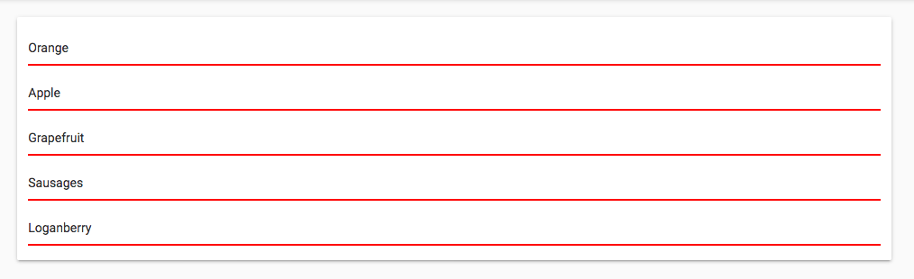
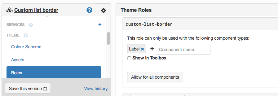
I created a Role called custom-list-border:
Then in theme.css, I added
.anvil-role-custom-list-border {
  border-bottom: 2px solid red;
}
Of course, you can do anything that CSS can do.
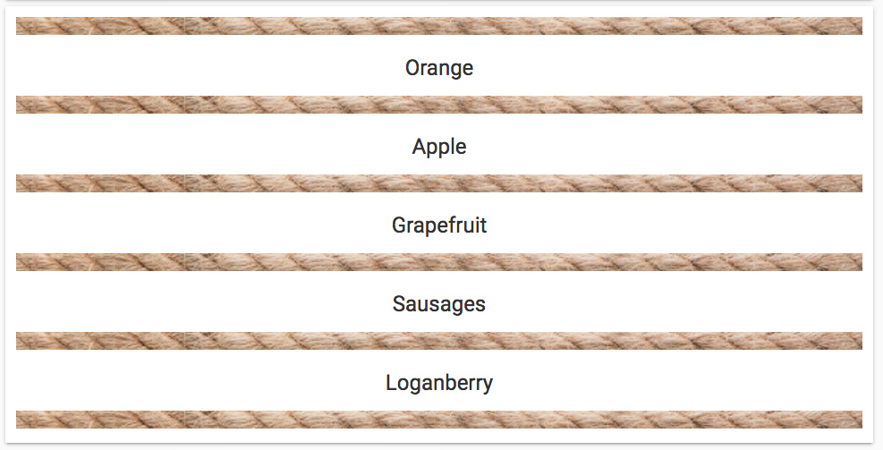
If you want to use an image for the border, you can simply drop an Image component into the bottom of the ItemTemplate:
Here’s a clone link for an app containing both those examples:
1 Like