My code is working fine. But I don’t understand it  I made a
 GridPanel, with six Links. They are displayed as one row. Each Link has an Image (a *.png that shows a dice face). The images are all the same. And when I ran the code, it displayed as expected.
However, when I ran the DevTools simulator, with the screen width of a cell phone, the images weren’t visible. I couldn’t see them when loading the app on an actual cell phone, either. The images weren’t visible on a small screen.
I spent a frustratingly long time experimenting with the Image components–changing their height and display_mode settings. Didn’t matter.
I experimented with different containers, trying alternatives to the GridPanel. Didn’t matter.
It was only when I started experimenting with the Link components that I figured out how to display the images on a small screen. I had to increase the width of the links.
What’s happening here? Do I need to maximize Link (and other components) widths to assure they’ll be visible on all screen sizes? … What is it I should be focusing on to be sure components in a container will display responsively (or predictably) as screen sizes change?
EDIT:
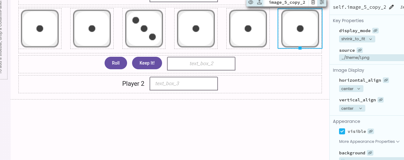
Here’s a screenshot of the IDE in Display mode:
Can you share a clone of your app? Depending on exactly what you want and how you’ve implemented it, we need those details to help 
Thanks, Duncan. Appreciate the response.
I attached a screenshot. I truly just started the project; I haven’t written any code. I included the properties panel for an image (each image has the same properties). Properties for the links that each image attaches to are default; I haven’t changed them–except for manually changing their widths.
Everything’s displaying as hoped, it’s just that I spent a lot of time experimenting with images and containers before figuring out I need to be changing the link widths. I’m looking for the conceptual knowledge—the “rules”—to figure out in the future what I need to work with to get components inside containers to behave predictably. … Thanks again!
1 Like
Which parts are unpredictable to you? Or is it that all the dice are almost the same except for a few things and it feels like repeating yourself?
I suppose ‘predictability’ could mean different things to different people; I understand my lack of clarity. I guess to me predictability means laying out components and their properties in the form designer, and then knowing how they will look when displayed on different sized screens.
But, to make this question more tangible, how can one place links with images inside a container such that they’ll be displayed in a single row which will size proportionally as screen width changes, i.e., each image link uses, say, 15% of the viewport, with 2% used for the space between the link-images?
Hi @acolburn3,
Have you tried using a ColumnPanel or a FlowPanel to hold your images? You can set a ColumnPanel to wrap its contents either on mobile or on tablet screen size. With a FlowPanel, the components will wrap as the screen changes size. If you instead want the components to shrink as the screen shrinks, you can select each component within the FlowPanel and toggle its expand property to True.
I appreciate that this isn’t particularly intuitive! I’ve raised an internal issue to update our documentation on FlowPanels to explain that you can set its components to expand.
1 Like
Thank you, @brooke. You’re right—I did not know about the expand property for items inside FlowPanels! Anvil’s documentation is awesome . . . but more would be even better
Even after reading (some of?) the documentation I’m not 100% certain I understand some of the differences between containers, esp. after realizing ColumnPanels operate differently when adding components in the graphical designer vs. within source code.
I feel like clarity could be increased if ColumnPanel, FlowPanel, and LinearPanel were replaced with simple Row and Column components, with consistent properties (like expand) making it straightfoward to display components responsively, etc. I am merely a hobbyist, but I am influenced by things like how Flutter handles rows and columns, or the QT Designer’s allowing “springs” for spacing within rows/cols, changing their sizes as screen sizes change.
Thank you again.
1 Like
Hi @acolburn3,
We are aware that our Container components are not the easiest to understand/use, so feedback like this is very valuable! I’ll have a look at Flutter and QT Designer
1 Like