As a future note to myself and maybe someone else might find this useful as well: Here’s how to hack together a half pie or half donut chart with Plotly in Anvil.
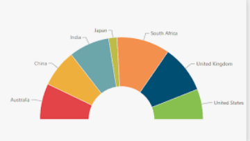
Plotly by default does not have half donut or half pie charts, like these:
Here’s a workaround how to still make a half or semi pie chart in Anvil:
(1) Get your data and add one extra data point
This extra data point is as big as the sum of all other values. This will be the slice that serves as the “lower half” of the chart.
values, labels = anvil.server.call('calculate_mortgage_times_to_maturity')
values.append(sum(values)) # add value for lower part of part chie
values.reverse() # reverse order to start with 1 year window
labels.append("")
labels.reverse()
colors = ['black', 'lightcyan','cyan','royalblue','darkblue','lightcyan'] #  set colors for slices
With the extra data point in black, making up half the pie chart:
(2) Plot data with Plotly
Ideally make the slice making up the lower half of the pie the color of your background. Reduce the layout margins to make sure the plot is nice and big.
import plotly.graph_objects as go
self.plot_time_to_maturity.data = go.Pie(labels=labels,
                                                     values=values,
                                                     hole=0.5,
                                                     showlegend=False,
                                                     textinfo='label',
                                                     sort=False,
                                                     rotation=90,
                                                     marker = dict(colors= colors),
                                                     )
    self.plot_time_to_maturity.layout.margin = dict(t=0, b=0, l=0, r=0)
    self.plot_time_to_maturity.config = dict(displayModeBar = False)
    self.plot_time_to_maturity.layout.font.size = "9.5"
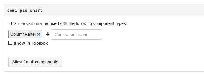
(3) Add a new role
Here’s how, in our case the role “semi_pie_chart”.
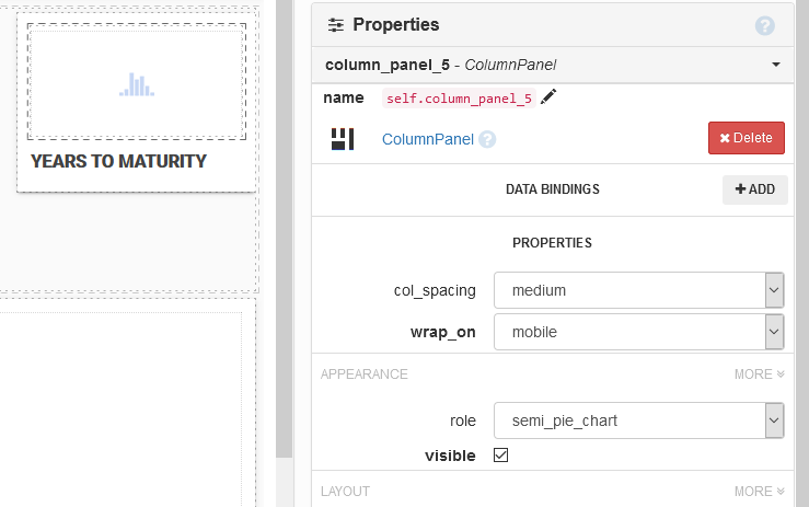
(4) Put the plot in a panel
Put your plot in a panel and then assign the role you just created to this panel.
(5) Add custom CSS to theme.css
To limit the height of the role and effectively cutting off the lower part of your pie chart, making it a half pie chart. Set height to what works for your app.
.anvil-role-semi_pie_chart {
height: 100px;
overflow: hidden; /* Hide scrollbars */
}
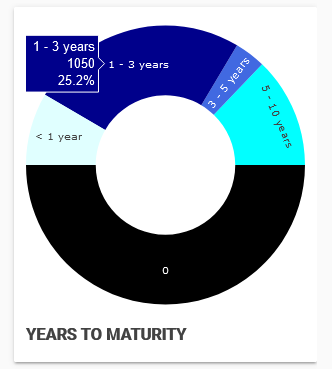
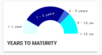
End result:
Note: If you have a spacer underneath the panel that your plot is in, this might interfere with setting the height of the panel.