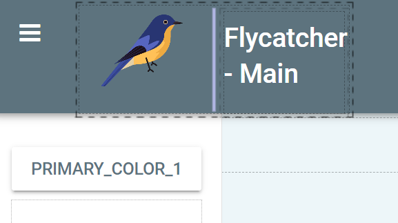
I’m trying to edit the “Material Design” template, and I’m looking to add an image next to the slot where you put a Title.
To do this, I put a column panel in the slot, and filled it with an image file and a rich-text label.
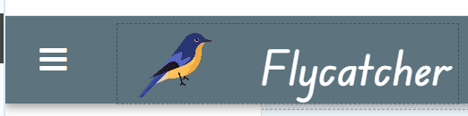
However, the spacing / formatting is all bizarre. How can I clean this up? I would want the text to not wrap (which is causing the whole bar at the top to expand).
You should be able to do this by applying a role but it would be easier to explain if we could have a look at a clone link. Are you able to supply a clone link ?
This was hard, I could not figure it out why it was doing that either, I think I just haven’t started a new project in a while and got rusty.
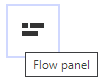
If you drop both components (the picture and the headline) into a flow panel object and then drag the flow panel back into the same spot, it should give you handles to change the sizes and stop it from wrapping.
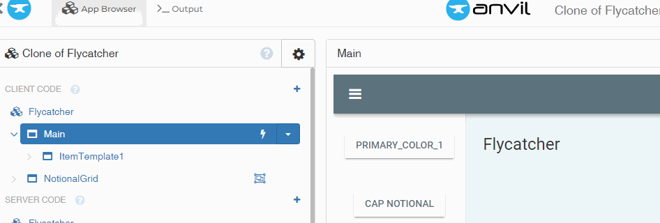
It was previously just in a column panel.
Any chance you know how to remove some of the padding easily (it seems to restrict how big I can make the icon). At the moment I have it kind of silly small before it cuts off
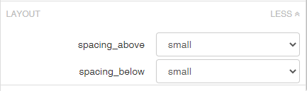
Yeah, I’ve been trying to use those "spacing above, below’ fields, but I cant seem to get this to line up nicely. Something about the spacing is driving me nuts… I would want the wording to be centered on the image & within the bar (so the bottom of the ‘y’ wouldn’t touch the bottom for example).