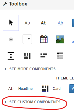
Nice feature. One wee inconvenience: all imported components do show up in the toolbox, making the custom list quite long. Especially since icon, full name and source are shown, often taking one line per component.
Would be nice if we could add the following to a custom component:
- Icon to show. Defaults to the generic icon.
- Text to show. Defaults to whatever it is now.
- Suppress text. Text will still be shown when hovering over the icon.
Also the source is now printed behind the name, in a smaller fontsize. Perhaps it could be under the name instead.
6 Likes
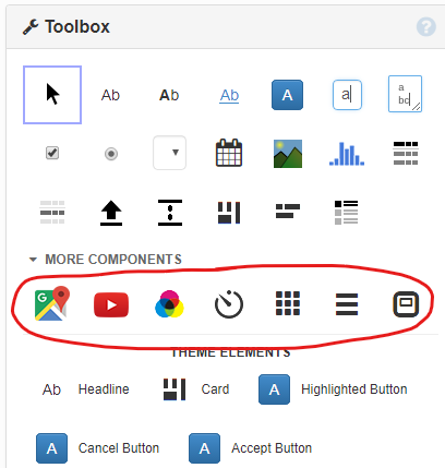
An alternative approach to the extreme cluttering of the Toolbox area would be to include all the custom components in the “MORE COMPONENTS” section.
I used to have my own CustomComponents app which contained all my custom components. I got rid of it and split it into many smaller apps, one per custom component for this very reason: because I didn’t want to see a long list of useless custom components on the toolbox. Now every app only shows the few custom components it actually depends from.
In the past few days I started using AnvilExtras and I’m back to the ugly cluttered toolbox. Even apps that depend from AnvilExtras only because they need the routing module have a cluttered toolbox.
Obviously @gijs.mos 's request would look more professional and I would love to see it implemented, but it would still leave a bunch of components that are almost never used occupying precious real estate.
One day I will find the time to create a Chrome extension so I can assign keyboard shortcuts to these 2 (and a few more) little commands:
$("[toolbox]").show()
$("[toolbox]").hide()
4 Likes