When working with several tabs open, would be helpful to have their icons colored.
Here a quick glance is often enough:
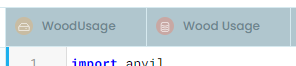
Here I need to actually read:
When working with several tabs open, would be helpful to have their icons colored.
Here a quick glance is often enough:
Here I need to actually read:
This is a tricky one - early designs did do that, but they were far too visually noisy. We will be conducting a design review once we’ve collected a batch of feedback like this, and I’ll make sure this is discussed with our designers.
I would prefer a colored bottom or top border instead of having the icons colored I think. But I could get used to either.
I do agree that the current no color system requires me to read and remember what everything is.
It’s even worse than I described earlier: sometimes even putting the effort of reading is not enough, so I can’t use the tabs and I need to click on the tree on the left.
Here I have both a form and a table called Releases. Reading the name doesn’t help and the gray icons are too similar to make a difference:
![]()
The tabs are colored now, thank you!!!
They are colored… but it would be nice to have a bigger contrast.
In this case I have a table and a server module with similar names and it’s difficult to distinguish them:
It would be nice to have the orange and the red a little more different, especially when grayed out.
Not everyone is blessed with a super-bright monitor in a super-dim room (or super eyesight). So maintaining a substantial degree of contrast (for the less-fortunate) would be welcome in places like this.