Dashboard for real-time data

Dear Anvil community,

I am presently experimenting with live data streaming.

I was wondering if Anvil has put thoughts into making a template available as a starting point to create a dashboard. When I mean dashboard, I mean something like this:

The data is retrieved through an API. The granularity is very high (every second). I think it should be smoothed quite a bit!

I would be happy to start with a live linear graph showing a stack of a few sensors only, raw incoming data. Then we could elaborate from that.

It has to look pretty (dark theme, etc) and not something ā€˜matplotlib’ like.

Please let me know if there is already a template somewhere!

Cheers
Anne

Hi Anne,

That sort of thing in definitely possible in Anvil. There are two aspects to it: real time dashboarding, and themeing.


Dashboards driven by APIs in real time

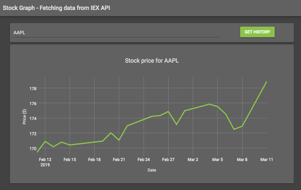
Have you seen the dashboard workshop? It steps you through building a dashboard driven by an external API. The final dashboard isn’t live, but you can easily make it so by using a Timer to fetch the data and update the plots.

https://anvil.works/blog/workshop-data-dashboard

You can copy the final dashboard app using this clone link:

https://anvil.works/ide#clone:ZQDC7HYGJ3MLUQTX=Z6O2TKNUJIK4IDVGEIMTUAX7

The function that fetches the data is this:

@anvil.server.callable
def get_weather_for_day(dt):
  """Get the weather data for a particular day."""
  # Construct a URL based on the datetime we've been given.
  url = dt.strftime('https://www.cl.cam.ac.uk/research/dtg/weather/daily-text.cgi?%Y-%m-%d')

  # Get the raw data by making an HTTP request.
  raw_data = anvil.http.request(url).get_bytes()
  
  # Parse the data and return it.
  return parse_data(raw_data, dt)

(The parse_data function is about 35 lines of data munging to deal with the slightly odd data format used by the weather data API.)


Dark theme

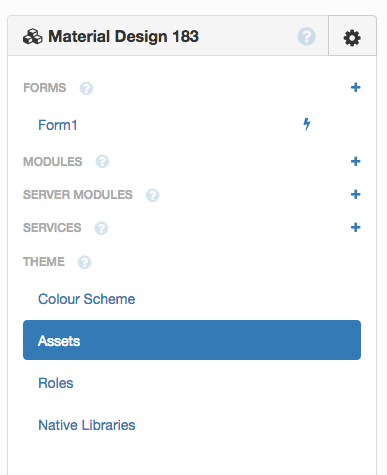
In terms of themes, you have complete control of the HTML and CSS of your app under the Assets section in the App Browser

14

You can also get some way just by changing the colours in ā€˜Colour Scheme’.

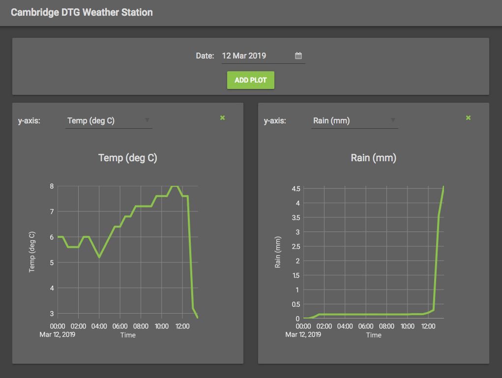
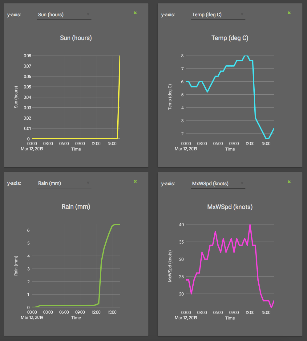
Here’s a version of the Weather Data Dashboard that I’ve styled to have a dark theme:

(Yes, it’s raining pretty heavily in Cambridge right now!)

Plots can be styled using the in-built Plotly Python API (here are the docs). This dark-themed dashboard has a Custom Component to create the plots - the styling is applied in the Custom Component, so each plot gets the same style. Of course, if you want many different types of plot, you can create a Custom Component for each plot type - and you could have one function to set up the basic style, which you then modify in each Custom Component (see ā€˜Porting the dark theme’ in my post below).

Here’s the clone link, you can copy it and make use of it:

https://anvil.works/build#clone:45P6YP3TI2YVVBJR=VQ6JPJXENMPQLG6Y4P2QGI5W


Does that help? Is there anything that seems to be missing? If you have any questions, please ask :slight_smile:

P.S. How is your oil well exploration project coming along?

3 Likes

I’ve just ported the dark theme to a very simple plotting app whose data fetching function is just:

@anvil.server.callable
def get_chart(symbol):
  url = 'https://ws-api.iextrading.com/1.0/stock/{}/chart/1m'
  return anvil.http.request(url.format(symbol.lower()), json=True)

https://anvil.works/build#clone:KEMQ3J457VGK4MMU=SV57YJTLV53AHXNBQ3SBBZGV


Porting dark theme to an app

To port the dark theme to an app:

  1. Copy the CSS from theme.css over the theme.css of the target app
  2. Make sure the Colour Scheme uses the same colours.
  3. Apply the dark colouring to any plots by doing self.plot_1.layout.update(dark_layout), using the following settings:
from copy import copy

dark_font = {
  'family': 'Roboto',
  'size': 14,
  'color': '#ddd',
}

dark_axis = {
  'color': '#efefef',
  'gridcolor': '#888',
  'titlefont': dark_font,
}

dark_layout = {
  'paper_bgcolor': 'rgba(0,0,0,0)',
  'plot_bgcolor': 'rgba(0,0,0,0)',
  'xaxis': copy(dark_axis),
  'yaxis': copy(dark_axis),
  'font': dark_font,
}
3 Likes

(For anybody reading this and thinking ā€œall that dark theme and real-time data dashboard stuff is nice, but what’s happening to the weather in Cambridgeā€: I’m pleased to announce that the sun’s come out.)

5 Likes

Hahaha, that looks more like the kind of weather we have on the west coast of Norway :wink:

Thanks a lot Shaun, the static dashboard illustrated in the blog seems indeed to be a good starting point :+1:

My data is coming in from the CogniteClient. CogniteClient is an open source Python library to access the Cognite Data Platform. Anybody can get an API key and practice on data which is streaming in with one week delay from the Valhall offshore rig. It is of course only a small part of assets on the rig, and they are not part of the drilling or production data :wink:

So from the client, it is possible to get the sensors timeseries directly in a dataframe:

df_asset_children_timeseries = client.time_series.get_time_series(path=str([asset_id])).to_pandas()

The sensors are grouped in assets (for instance you can have several sensors, temperature, flow, pressure on a water pump).

I am having a look at this in order to try to have some understanding of what it means to stream in live data… Basically Cognite has put in place a Data Platform at AkerBP (it’s not a secret) and now they get TONS of data streaming in from TONS of sensors on the rig, and it’s like: OK, let’s do STUFF with that now :stuck_out_tongue::smiley:

About the exploration well app: I actually showed it during a visit to a company yesterday (we call that ā€˜unformal discussion’, it’s like a pre-interview). The guy I talked to immediately mentioned other information we could also add on, as different layers in the app for instance.

Well I guess you are familiar with that issue: the days seem to have less and less hours. Too many projects! And I am not even working!

Thanks for taking the time to answer in details!

Cheers
Anne

1 Like