Hello Anvil Community,
I’m currently using the default pop-up login form on my Anvil web app and have enabled the option for users to log in with Google and Facebook. However, I’ve noticed that the appearance of these buttons is not quite up to par.
Here’s what they currently look like:
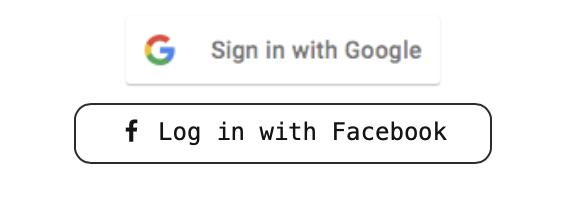
As you can see, the buttons are not uniform in appearance and the Google button is noticeably blurred. This inconsistency in design is not ideal for the user experience I’m aiming to provide.
I’m wondering if there’s a way to customize these buttons to make them more consistent and visually appealing. Is it possible to upload my own button images while using the default pop up form?
Additionally, I’m curious to know if Anvil has any plans to update these images in the future to provide a more consistent and modern look out of the box.
Any help or guidance would be greatly appreciated. Thank you in advance!