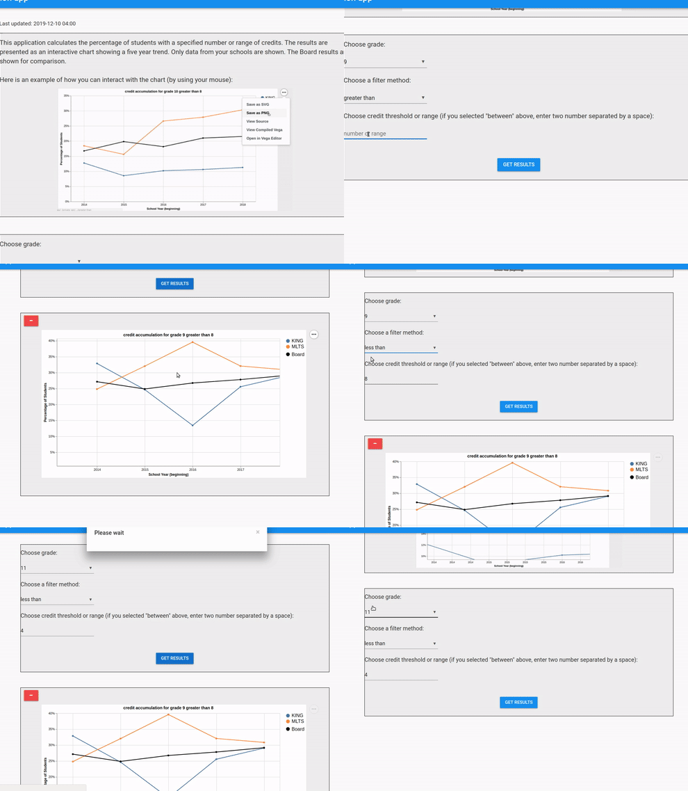
This is a perfect example of something that Anvil makes so easy. This app only took one day to put together. It is simply a set of filters that are used together to present an interactive chart. The chart reflects the percentage of accumulated student credits over time. When new criteria are chosen, new charts get added to the screen, making different views of the data easy for folks to compare. Here’s a GIF with some fake data:

For those who have not seen the post, click here to see a large list of apps from the Anvil community.