This is in the Material template.
I can get labels to, no problem, but links just won’t do it. The first link goes in but the second one will only drop below.
I used to be able to, but since messing up my layout trying to add a new component (see this issue : Improving IDE Component Layout) I’ve been unable to correct the error.
It’s fine in the custom HTML layout template.
Scratch that bit (I just deleted in an edit) - I’m getting confused…The Material template bit is showing the issue, but the other template seems fine. No help to me though as my project is in the material template …
I just tried with the default material design and could only put links side-by-side if I the column panel was not nested within another column panel. For example, if I delete “content panel” the links could go side-by-side, otherwise I see the same as you David.
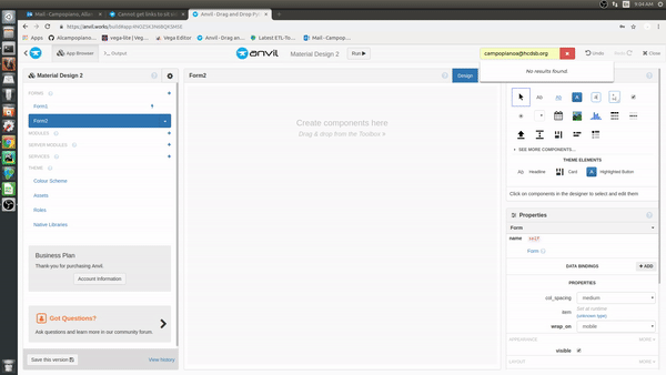
So, just to be clear, this first vid demonstrates the link side by side issue. Note that I can (eventually) get the second like to sit underneath the first link ok, but attempts to get it to the right of it just fall outside of the control panel :
I can confirm this on my end as well. Although as I mentioned, if I’m on the start-up form for the Material Design and I delete everything there, and re-add the column panel and links, I can get them side-by-side. This does not work if I start a blank form as David has shown.
start-up form (cleared components and began to add). This works.
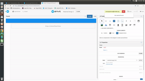
opened a blank form, added components. This does not work.
Moving to Bug Reports – we’re working on it!
(In the meantime, as an ugly workaround, you can switch the role of the ColumnPanel to card, which will give it a bit more padding, which gives you space to drop things next to a Link inside it!)
1 Like
…and if you don’t want the other card styling bits, I’ve just created a role with a bit of padding in it and used that. Seems to work.
.anvil-role-cp-link-bug-workaround {
  padding: 4px;
}
Increase it if you still find it hard to position. Might throw your layout out slightly if you had things lining up.
You can always change it back once you’ve positioned all your components inside it!
1 Like
I’m really having a bad fortnight - that never even occurred to me!