When I have both an icon and text on a button, the spacing between them is wider than I would like:

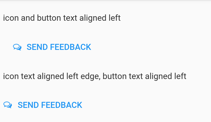
Above, I have both icon and text alignment set to “left.” If I instead change icon alignment to “left edge”, I get:

Then I can add some spaces to the start of the text string to get the spacing between icon and text how I like it. However, icon_align = “left_edge” causes a new problem: the button becomes right-aligned within the panel, despite the text alignment remaining set to “left.”
Am I missing something, or is this (particularly the “left_edge” causing right-alignment) a bug? I have no CSS skills to try to fix this myself, alas.
1 Like
@hugetim
Hi there,
I can’t seem to replicate this but perhaps I don’t have things set up the way you do.
I’ve got an app here where I compare the “left” vs “left edge” settings in a flow panel. Things appear normal to me. I’ve also tried it where the components are both sitting in a column panel.
Are you able to share a clone or modify the one below to demonstrate the issue?
clone:
https://anvil.works/build#clone:WSIJW3EUZHPMY4DD=WZU5CL2JIKK4XQNIC3UFGYD3
[Moving to Bug Reports]
Likewise – I have tried to reproduce this, but can’t! Can you share a Clone link with me, @hugetim (even privately)?
Ok, it looks like the spacing/alignment issues I described only occur when the button is in the sidebar. Here’s an app derived from @alcampopiano’s that reproduces the issues:
https://anvil.works/build#clone:3SKT7IEBBXAZKAND=SSKZ6GIMAIJEBYS3ZYRGWLIQ
Ah, yes – the Material Design CSS does specific things with icons in sidebars, so they adopt the spacing specified in the Material Design spec (which is, you’re right, pretty large!)
We should probably update the CSS to make left_edge more benign…
2 Likes