Building a rich table as a custom component

Hi all,

I know that a data grid is our most requested feature right now - and we’re working on it! However, in the meantime, let me show you just how much you can do with an Anvil custom component. In response to a question on another thread, I built a Custom HTML form that builds a table in HTML. Here it is (NB updated link):

anvil-clone-button

It’s a custom component, and you use it like this:

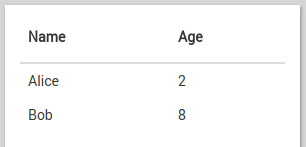
    self.table_1.columns = ["Name", "Age"]
    self.table_1.data = [{'Name': 'Alice', 'Age': 2}, {'Name': 'Bob', 'Age': 8}]

And it looks like this:
image

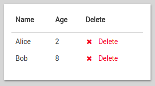
You can also customise what appears in each cell. By default, it creates a Label, and sets its text property by looking up the specified key in each row. But you can provide a function that returns any component you like! Eg, this code adds a “Delete” link to every row:

    def mk_delete_link(row):
      l = Link(icon="fa:times", text="Delete", foreground="red")
      def del_row(**p):
        self.table_1.data = [r for r in self.table_1.data if r != row]
      l.set_event_handler('click', del_row)
      return l
      
    self.table_1.columns = [{'title': 'Name', 'key': 'Name'},
                            {'title': 'Age', 'key': 'Age'},
                            {'title': 'Delete', 'mk_component': mk_delete_link}]

It looks like this:
image


PS: Yes, this is a preview of what our data grid API might look like. Let us know how you get on!

3 Likes

In your custom HTML, where is the CSS for “table”?

<table class="table my-table">

I assume that’s what sets the colours/thicknesses of the lines, font weights, etc.?

(edit) - ah, are they standard bootstrap classes? Inspecting the page suggests so (v3.2.0).

And another one :slight_smile:

.search(tables._page_size(5))

This is from the example project - is there a list of all the properties for tables (like _page_size()) somewhere, or is there some way I can discover them? “Help” & “dir” don’t give much away.

Oops! That was testing code that shouldn’t have been in that app. _page_size is an internal testing hook that could change meaning or go away tomorrow. Don’t use it! I’ve yanked it out for now :smiley:

The Data Tables interface for managing one-to-many relationships (Link to rows) is similar (no pagination support that I have seen as of yet), but importantly, enables selection of listed rows. A very common use for a data grid in an app I am currently building would be to manage one-to-many relationships. The needed differences from the Data Tables interface include being able to select which fields/columns to display, the ability to sort by any column (ascending or descending) as well as the ability to search or filter on select columns (with full-text search, a la SQL LIKE %SEARCHSTRING% syntax). Being able to paginate the result set and still robustly track selected records for relationship purposes would be critical.

I have now updated this table component to add pagination support. To use it, set the page_len value to a number (it defaults to None, which means no pagination).

@splinter - What you propose can certainly be built with this component! I don’t have time to run off a demo right now, but if you post a “Demo request” in the Feature Requests forum (especially if it gets lots of likes), we’re more likely to make one!

@splinter - I cracked and built you a demo. It’s a simple one-to-many relationship - you have groups, with members, and you can edit the membership list with a searchable paginated popup.

Here it is (you’ll need to change the dependencies to your own copy of the Table app and recreate the Table components): https://anvil.works/ide#clone:3CUOLZTFPAYLMH6Y=OQK35BVP4RBU4VXZPXUZCV3H

2 Likes

@meredydd - Ok, trying to use this, have a table that is exploding with rows and need the full data grid support described above.

the configuration of data doesn’t look like it supports pulling data from relationships, is that supported?

For example:

self.group_tbl.columns = [
{‘title’: ‘Date’, ‘key’: ‘created_at’},
{‘title’: ‘Reserved by’, ‘key’: ‘reserved_by’}

the reserved_by field is a link to a single row in the users table, i need to pull information from the row in the users table (ideally, a concatenation of first_name + " " + last_name, but that’s another thing). is there any way to reference on through in the table configuration?

still need support for sorting by any column by clicking on the column title (toggle between ascending and descending on additional clicks) as well as search on any field and full text search support.

also, how would i format a date?

is there any way to reference on through in the table configuration?

Yes there is! If you specify a key, the table will create a new Label containing that key in the row, assuming it’s a string. But if you specify a mk_component function, you can take complete control of building the component that appears. Here’s an example, calling strftime on the date column to format it nicely, and doing the a reference lookup on the reference column:

self.group_tbl.columns = [
  {
    'title': 'Date',
    'mk_component': lambda row: Label(text=row['created_at'].strftime('%b %d, %Y'))
  },
  {
    'title': 'Reserved by',
    'mk_component': lambda row: Label(text=row['reserved_by']['first_name'] + row['reserved_by']['last_name'])
  }
]

(NB I’ve used lambdas for conciseness here. They’re sprawling a bit; if you do anything else with them I’d recommend defing a separate function, like I do with mk_delete_link in the example at the top of this thread.)

(NB #2: Of course, you don’t just have to put Labels in your tables. You can make “click to see details” buttons or links, or TextBoxes to edit values…)

1 Like

How would I go about adding support for setting a table to be not visible, then making it visible with a link or button?

Huh - looks like I didn’t include a “visible” property! The easiest thing for you is probably to put it inside a LinearPanel and set that as invisible.

(A more comprehensive fix would be to add a visible property to the custom component, then wire that up to calling jQuery toggle() in Javascript – I might do that later today if I get round to it.)

2 Likes

So, I’m using this in a production app now and wanted to give feedback on success thus far.

  1. This is definitely a huge improvement over using linear/repeating panels for large lists, I’ve also added support for First and Last navigation to go to the end or back to the beginning of a data set. Will share my modified custom component here soon.
  2. Search/filtering/sorting support and performance: when searching, the architecture separates retrieving data as the first stage (all records), and then handing the data set to the component as the second stage (loop through and search using Python ‘in’. It is unclear to me at this point whether the component iterates through the entire data set (list) before displaying the first X records or not when there are no search terms, but the search support depends on iterating through the entire data set, for instance:

search_data = [h for h in app_tables.hotels.search(active=True) if search_hotel in h[‘name’].lower()]

This means that full-text search actually works since we’re using Python ‘in’ to compare the search term with the column, but I’m not sure how it will scale with thousands of records (or more)… will be learning soon.

2 Likes