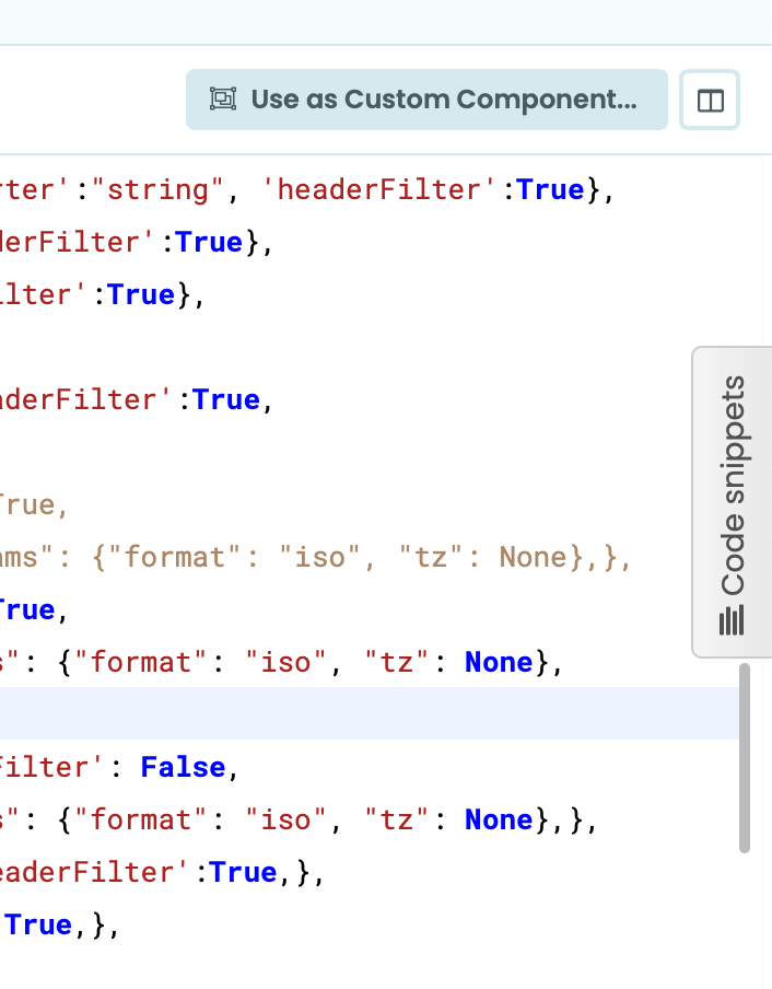
The “use as custom component” is very prominent. However this functionality is not frequently used.
The Code snippets tabs polutes the editor area (esp on smaller screens). It is superfluous since the code snippets can be toggled with the button just above.
Embarcadero’s RAD Studio has offered the ability save named IDE layouts for a decade or more. Further, you can designate a default “editing” layout and a default “debugging” (program-run-time) layout.
Edit
If implemented, this takes IDE clutter out of Anvil’s hands, and into ours – for better or worse!
Wing IDE defaults to everything being on display. Maximum clutter. Not at all beginner-friendly. So I suspect that the newbie default should have minimum clutter, to avoid scaring people off.
With pre-packaged layouts available for different tasks.