IMHO the new editor’s home page space is not well organized.
The majority of the space is consumed by a few, static information: the button “Blank App”, the templates (red box) and the bottom half of the central section has only “Learn Anvil” link.(green box)
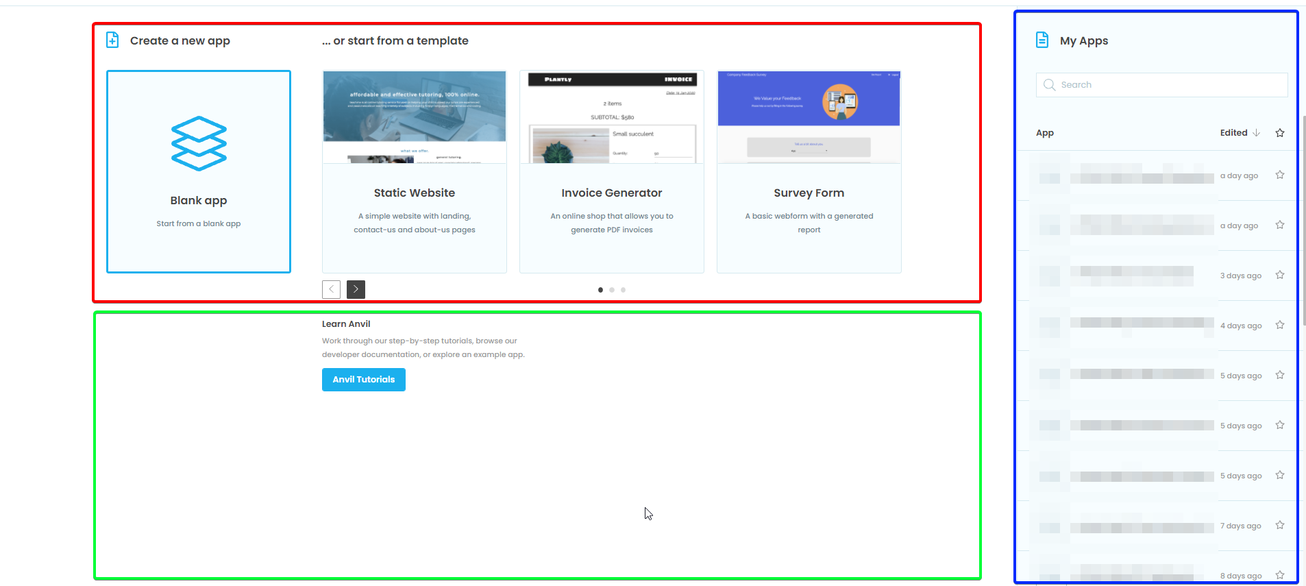
The majority of the information (my Apps) are recluded to the rightmost 1/5th of the screen…
It looks to me a waste of space.
I don’t want to lay down my layout, but I’d like to have the majority of the space for all my apps listed with as many info as could stay there (lengthy name, creation date, modification date, favorite, adding: tags? folders?)
Then a minor sections for templates and blank app button and another little one for Tutorials link.
Does it make any sense?