What I’m trying to do:
I’m trying to show a modal with vertically aligned buttons.
What I’ve tried and what’s not working:
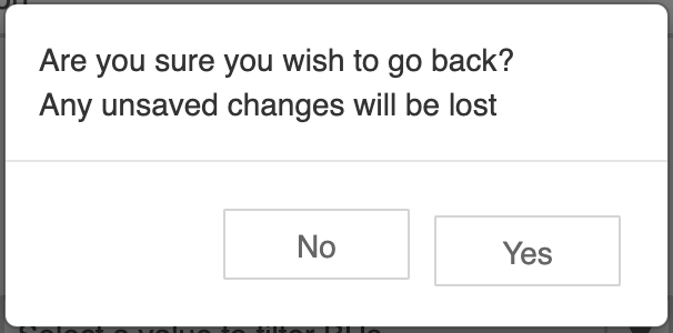
c = anvil.confirm("Are you sure you wish to go back?\nAny unsaved changes will be lost")
It’s because in the currently shipped bootstrap.css?sha=c72a0381af84afb75234 styling, lines 6034-6037:
/* line 6034-6037 */
.modal-footer .btn + .btn {
  margin-bottom: 0;
  margin-left: 5px;
}
which override the margin-bottom for that second modal (from 6px that is set somewhere else, looking at the computed CSS in the inspector):
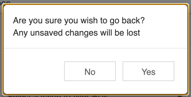
Styling hack to fix:
By overriding that little bit in our app’s styling like:
/* Fixing up bootstrap for styling the confirmation modal */
.modal-footer .btn + .btn {
  margin-bottom: 6px !important;
}
can fix up the model and I get aligned buttons:
but this alignment either with a similar fix, or some other ways that is suitable for the whole look, should really be the default for the AnvilX, right?