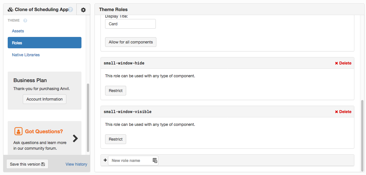
I’ve created a couple of Roles that let you decide what to show and hide when the window is small.
This gives you the tools to decide what disappears, what stays, and what moves elsewhere, from the top nav.
Here’s a version of that app that keeps the hamburger button and app title visible when the window is small (including on mobile):
https://anvil.works/build#clone:DHRDXLLFDMKDY3I6=7MMCIQ57MQXCXBACUWKT7ZQ5
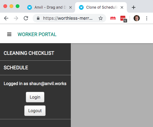
The ‘logged in as’ and ‘login’/‘logout’ buttons move to the side nav when the window is small:
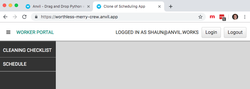
When the window is larger, they are in the top nav as before:
How it works
As well as the original components:
label_login_statebutton_loginbutton_logout
I have created:
label_login_state_mobilebutton_login_mobilebutton_logout_mobile
The original components have the small-window-hide role, and the new components have the small-window-visible role.
I’ve added these lines to theme.css in the Assets, these are the lines that enact the show/hide:
.anvil-role-small-window-visible {
  display: none;
}

@media(max-width: 767px) {
  .anvil-role-small-window-hide {
    display: none;
  }
  .anvil-role-small-window-visible {
    display: block;
  }
}
(I also had to add padding to Labels in the sidebar by adding .sidebar-elt .label-text to this existing rule in dashboard.html) :
.sidebar-elt .content a.anvil-component, .sidebar-elt .label-text {
    padding-left: 14px;
    padding-right: 14px;
}