I often want to show completely different forms if the user’s screen is below a certain size (eg mobile), as I am completely unable to create multi-device forms that resize well and look good.
I’ve only tried this in a SPA (ie the main form remains open throughout) using the Material design. Hope it’s useful to someone.
Please correct or better the code if you can/want to. I am even less of a JS expert than I am Python …
In your standard-page.html which is provided when you choose “Standard Page” as your form, put the following at the end :
<!-- unique ID required for anvil call backs form JS -->
<div id="main-page-id"></div>

<script>
  // Required to send you an initial page size.
  $( document ).ready(function() {
    resizedw();
  });

  function calculatePageWidth() {
    var w = window.innerWidth || document.documentElement.clientWidth || document.body.clientWidth;
    return(w);
  }

  // This resizing pseudo-throttling routine was got from here :
  //	https://stackoverflow.com/questions/5489946/jquery-how-to-wait-for-the-end-of-resize-event-and-only-then-perform-an-ac
  // It's the answer under the accepted one.

  function resizedw(){
    anvil.call($('#main-page-id'), "page_resize_event", calculatePageWidth());
  }

  var doit;
  window.onresize = function(){
    clearTimeout(doit);
    doit = setTimeout(resizedw, 100);
  };

</script>
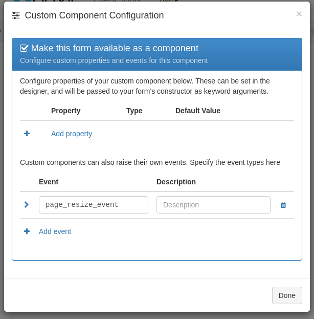
Create a new project (Material Design), and add the ClientTools project as a dependency. When you do so, the PageResizeDetector form should appear as a custom component in the IDE.
Drag a column panel onto the left hand menu column (where you would also add links for your menus), and drag your custom component form here too.
This is amazing! Thanks so much David. I dread to think how many hours I would have spent on this in the alternate reality where you hadn’t posted this!