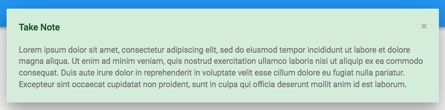
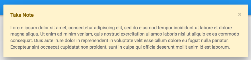
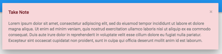
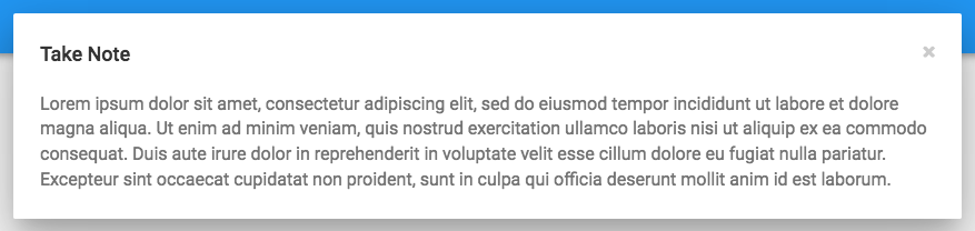
We’ve updated the Material Design CSS to style notifications like the images below. We’ll deploy tomorrow morning, and from then on new Material Design apps will have these styles.
Success
Warning
Danger
Info
Existing apps
As always with style changes, you’ll have to add the rules manually to the theme.css of existing apps, because auto-merging style updates with files you may have modified would cause all kinds of pain. So please add these rules to any relevant existing apps:
body>div[data-notify="container"].alert-success{
  background-color: #d4edda;
}

body>div[data-notify="container"].alert-success>span[data-notify="title"]{
  color: #155724;
}

body>div[data-notify="container"].alert-danger{
  background-color: #f8d7da;
}

body>div[data-notify="container"].alert-danger>span[data-notify="title"]{
  color: #721c24;
}

body>div[data-notify="container"].alert-warning{
  background-color: #fff3cd;
}

body>div[data-notify="container"].alert-warning>span[data-notify="title"]{
  color: #856404;
}